Packaging the DPRK

Blog;

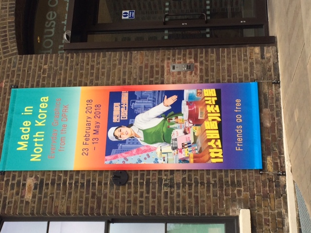
A unique collection of material texts currently on display at London’s House of Illustration gives a fascinating glimpse into everyday life in one of the most secretive modern states. Made in North Korea brings together posters, badges, food packaging, and comic book covers from the personal collection of Nicholas Bonner, who has led tours to the country for the last 25 years.

The artists who produce the posters, which promote the DPRK’s agricultural industries – ‘For a bumper crop, let’s send more chemical fertiliser to the countryside!’ and its political ideals – ‘With the full heart of a mother, let’s become good caretakers of the People’s lives!’ – are trained at state art colleges to paint in a particular style, using a distinctive palette of colours. The exhibition mixes posters from as early as the 1970s with much more recent ones from the last few years, and it is striking how little the style and conventions of these posters have changed over time.

The comic book covers are similarly unified, with titles such as ‘Woman Sniper’, ‘The Orders Must be Absolutely Fulfilled Until The End’, and ‘The Never-Ending Confrontation’ signalling their ideological purpose. Seeing what we usually think of as ephemeral material texts – labels for tinned fish and meat, sweet wrappers, and postage stamps – displayed alongside these explicit pieces of propaganda is a starkly colourful reminder of how even the disposable material texts of everyday life can be political.

Harry Potter: A History of Magic

Blog;

Twenty years after the publication of the first of J.K. Rowling’s books about the boy who went to Hogwarts School of Witchcraft and Wizardry, the British Library is celebrating with a major exhibition which brings together an impressive array of objects and texts to explore some of the folklore, traditions, and magical histories in the world of Harry Potter.

There are mandrakes and bezoar stones, dragon eggs, mermaids, and mirrors. From the British Library’s own chamber of secrets, treasures brought out for the exhibition include a seventeenth-century manuscript that once belonged to Gabriel Harvey, which outlines ‘Howe experyments to be invysible must bee preparedd’. There is also the thirteenth-century Liber Medicinalis, containing the first documented use of ‘Abracadabra’, with an explanation of how to write the word repeatedly on successive lines, omitting one more letter each time, to create a cone-shaped amulet that could be worn around the neck to drive out fever. Readers of the Potter series will recall that magical books in Hogwarts are often emphatically material – perhaps furry, or noisy, or even violent things which might leak ink, require stroking, or at least must be handled with care. They would not be out of place alongside these intriguing testaments to ancient magical traditions chosen from the British Library’s collections.

But in some ways the most absorbing exhibits are the personal contributions from J.K. Rowling herself. There are handwritten drafts of chapters in biro on very ordinary A4 paper; typed pages of drafts with revisions by Rowling and her editor; and incredibly detailed charts that were part of her planning, showing how she managed the challenging task of weaving together very complex plots over seven books. There is a first edition paperback copy of Harry Potter and the Philosopher’s Stone annotated by Rowling, again in biro pen, with a mixture of charming illustrations and reflections on her experience of writing and rewriting. After Hermione’s encounter with a troll, for example, Rowling fills the blank space at the end of the chapter with a picture of some scissors and an unfurling ribbon, commenting: ‘This was the cut I refused to make – my editor wanted to lose the whole troll-fighting scene. I’m glad I resisted’. These material traces offer a magical glimpse into the processes involved in one of the biggest publication successes of the twentieth century.

dress-poems at Tate Modern

Blog;

Tate Modern is currently hosting the first UK retrospective of the work of Sonia Delaunay, who is known for her bold use of colour, movement, and abstraction. As the exhibition richly illustrates, Delaunay’s contributions to modernism spilled over from fine art into set and costume designs for theatre and dance, interior design, commercial publishing, advertising, fashion, and textiles.

During a career as artist and successful businesswoman spanning most of the twentieth century, Delaunay collaborated with others including her husband, artist Robert Delaunay, with whom she developed a distinctive approach to abstraction and colour, which they called simultanism. This interest in the rhythmic and vibrant effects of simultaneous contrast can be seen in her paintings, collages, book bindings, painted boxes, and garments, many of which have been brought together in this wonderfully energetic exhibition. She was also interested in the simultaneity of text and other forms of visual expression; she worked with Swiss poet Blaise Cendrars, producing the Prose on the Trans-Siberian Railway and of Little Jehanne of France 1913, in which the poet’s fictional journey from Moscow to Paris was accompanied by her stencil illustrations.

The exhibition also features some sketches from her series of dress-poems. The 1920s sketches are all that survive of these garments, for which she drew on the work of avant-garde poets such as Tristan Tzara, Vicente Huidobro, and Joseph Delteil to create ‘poems in motion’. These elegant dress designs feature her characteristically bold, graphic shapes – zig-zags, diamonds, circles, and lines – incorporated with painted words. The lettering is read across sleeves, waistlines, hems, and other seams and structural features of the garments, drawing the whole of the female body into an intensely visual and mobile expression of simultaneity.

341125 Sonia Delaunay, Dress-Poem no.1329, 1923

The Museum of Modern Art, New York. Purchased, 1980 © Pracusa 2014083

Magna Carta (An Embroidery)

Blog;

The Magna Carta has been much commemorated in 2015, its 800th anniversary year. One of the most original and impressive responses to this anniversary has to be artist Cornelia Parker’s project, Magna Carta (An Embroidery), which has just been unveiled in the Entrance Hall of the British Library. This 13-metre embroidered scroll is a reproduction of the Wikipedia article on the Magna Carta as it appeared in 2014. It has been stitched by almost 200 different people, including professional embroiderers alongside prisoners, lawyers, and judges, and high profile figures such as Edward Snowden and Julian Assange – all individuals for whom concepts such as ‘freedom’ and ‘liberty’ (words which appear many times in the Wikipedia article) have a particular resonance. If you have a few spare minutes, do watch this beautifully-produced film about the project, in which Parker talks about her vision for taking this text from the digital back to an analogue form, in an appropriately collaborative enterprise in which every contributor’s interpretation of ‘freedom’ might differ as much as their stitching technique and the quality of their finished work. If you’re in the British Library, don’t miss it!

another grave error

Blog;

IMG_1688

Another in our series of gravestone corrections: this one from the parish church of St Michael & All Angels, Beetham, in south Cumbria, showing some confusion over when John Saul died. There must be lots more out there – send them to me (lmfr2’at’cam.ac.uk if you find any!)

IMG_1689


set in stone

Blog;

IMG_1556

Here is another entry in our (very occasional!) series of gravestone errata: the memorial stone of Godfrey Washington (1670-1729), who was the great-uncle of the first President of the USA, George Washington. This stone is mounted on the north wall of the parish church of St Mary the Less in Cambridge, where Washington is buried, having been Vicar, and Fellow and Bursar of the neighbouring Peterhouse. The stone attracts a fair number of pilgrims, who note the eagle, stars, and stripes of the Washington coat of arms, from which the emblem and flag of the USA are said to derive. On closer inspection, however, there is apparent confusion over the year in which he died:

IMG_1559

What is the story behind this error? Is it really a careless mistake on the part of the stone carver, who perhaps lost concentration as he reached the end of his work? (Compare the story of American author Isaac Bashevis Singer, whose gravestone proclaimed him winner of the 1978 ‘Noble’ Prize for Literature…). There’s something especially surprising about errors and corrections in gravestone inscriptions. As texts, they are literally monumental and often sacred sites, and our expectations of their permanence and finality make any errors and corrections stand out as particularly affronting.

Epiphany chalk

Blog;

CMB

20 + C + M + B + 15

In many parts of Europe, it is customary to mark houses with specially blessed chalk on the feast of the Epiphany. The exact number of Wise Men who travelled to Bethlehem with gifts of gold, frankincense, and myrhh is not specified in biblical accounts, but they are traditionally named Caspar, Melchior, and Balthazar. Their initials are chalked above the front door and they can also stand for ‘Christus Mansionem Benedicat’, ‘Christ Bless this House’.

And the Word was made flesh: XII

Blog;

book1                    book 2

Here is the final exhibit, with thanks to one of our readers: the illuminated leaves showing the beginning of the gospel of John from the eighth-century St Gall Gospel Book (click on the images to see them in more detail). In literary terms, each of the four gospels begins in a different way – but the drama of St John’s meditation on words and the Word must have been especially inspiring for scribes producing such elaborate, precious versions of the scriptures as this.

Images: Gallica, Bibliothèque Nationale de France

And the Word was made flesh: XI

Blog;

lecternThis intimidating piece of metalwork is an iron lectern from the late nineteenth or early twentieth century, although you would be forgiven for thinking it was five centuries older. An imposing fortress ornamented with shields supports the book-rest, on which the opening of John’s gospel is cast in relief: ‘IN PRINCIPIO VERBUM’. John 1:14 appears around the base of the book-rest, above the battlements: ‘ET VERBUM CARO FACTUM EST’. The other church furnishings in this very eclectic exhibition have been associated with the altar, and the sacrament of the Mass. Here, however, the words from John are integral to a piece of ‘book furniture’, and the reminder that ‘the Word was made flesh’ underlines the words read from any book opened on this lectern.

Metropolitan Museum of Art; The Cloisters Collection, 1955
Accession Number: 55.61.18
Image: The Metropolitan Museum of Art

And the Word was made flesh: X

Blog;

Virgin and Child
This Catalan image of the Virgin and Child was carved from limestone in the middle of the fourteenth century, and still bears traces of polychromy and gilding. The infant Christ holds a book with both hands, and points us to the words visible on the open pages: ‘VERBO/CARO’ (left page); ‘FACTUM/EST.ET/ABIT/UIT M/’ (right page). Standing at just under life-size (132.7 cm tall), this statue offers a strikingly elegant exposition of John’s words, especially the end of the verse: through the Incarnation, Mary brought Christ ‘among us’.

Metropolitan Museum of Art; bequest of George Blumenthal, 1941
Accession Number: 41.190.282
Image: Metropolitan Museum of Art