relational gestures / a post by Helen Magowan
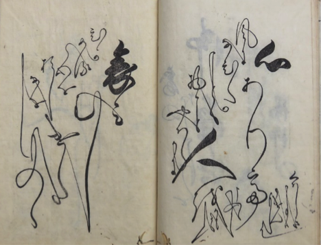
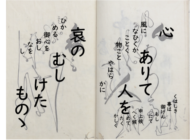
The first image in this blog post shows a page from a book published in 1713. In three volumes, it’s a collection of letters in the handwriting of a celebrity calligrapher called Hasegawa Myōtei. This page is part of a letter which, in heightened, literary language, advises someone to mend their bitter heart and be more like the willow tree which sways in the wind. The words vary between large and small, between thick rich lines and fine delicate ones; the forms are rounded and connected between letters and even between the vertical lines of text. The writing seems to drift downwards to the left, as if autumn leaves were falling in a gentle breeze.
This genre of publishing is called nyohitsu, the ‘woman’s brush’, and the books usually focus on letter-writing. The ‘woman’s brush’ extends to the style of writing which could also be used in commercial prose, and despite the name, it could be written by men as well as women. Nyohitsu was fashionable in the seventeenth and eighteenth centuries, with hundreds of books being published and republished, but it fell out of favour in the nineteenth century and is no longer practiced. Premodern Japanese script is almost completely illegible to most modern readers, so texts such as these that haven’t been considered important enough to transcribe are inaccessible to researchers, even when they are in the digital collections of libraries. In my research, my first challenge has been simply to learn to read them.
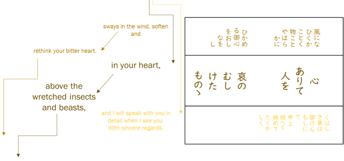
The next problem is the tension between what is on the page, and how I work with it. If I simply transcribe what I see page by page, it gives me fragments of phrases that don’t connect to each other, because the letter extends across the pages before and after in ways that we don’t expect and I can’t easily represent. Image 2 shows how I experimented with colour coding and arrows to follow how the reader moves backwards and forwards through the pages of the book. But while this helps illustrate how to interact with the text, it is unhelpful for a close reading of what the text actually says. For that, I still need to turn it into a readable, searchable, copy-and-pasteable typographic transcription.
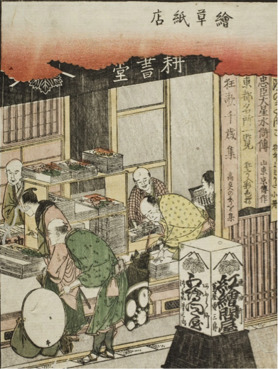
This process of typographic transcription is an ongoing project for scholars of premodern Japan, but we shouldn’t make the same mistake that early western visitors to Japan did. Early modern Japan had a vibrant and mature publishing industry catering to many different markets, including the women who were buying nyohitsu manuals or borrowing them from libraries. The third image shows a bustling shop full of customers browsing the illustrated books. However western visitors didn’t recognise this highly developed print culture, because Japanese books were floppy, stored on their sides, and they were woodblock-printed. We need to remember that woodblock printing was not a technological limitation, and moveable type was not a technological advance. Ceramic and wooden moveable type had been invented in China in 1040, and metal moveable type in Korea in 1250 a full two hundred years before Gutenberg in 1450. Moveable type was broadly unsuited for most applications of the character script shared by China, Japan, Korea and Vietnam, and woodblocks had advantages such as flexibility in combining text and image, and as the first image of the nyohitsu book shows, the ability to showcase the aesthetics of handwriting itself.
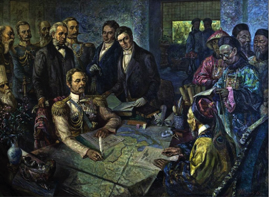
The shift from xylography to typography didn’t occur until the late nineteenth century, a period of huge change. The western powers had turned their attention to East Asia seeking new markets, and had shown they were willing to use force to get it. China’s ‘century of humiliation’ had already started with the loss of Hong Kong to Britain, and image 4 shows a treaty after their defeat by Russia. To avoid a similar fate, Japan urgently needed to be “modern” and “western”, and in the course of a few decades, Japan reorganised and revolutionised. This is the context for the shift to typography: all of the previous advantages of woodblock printing were now outweighed by the other imperatives.
Nyohitsu’s nineteenth-century disappearance is likely to be a complex picture, but its incompatibility with typography is clearly implicated. Japanese script had to fit the demands of moveable type: the numbers of letterforms were cut down, variation was eliminated and letters were disconnected from each other. Typography aims for repeatability, as well as transparency: we shouldn’t be distracted from the content of writing by how it looks. We understand of course that if we change fonts we get different effects, but the message remains the same. What we see with nyohitsu is different. It might look like a font, but acts like a linguistic register. What it looks like contains important information, telling us something about the writer, the reader, and the relationship between them, as well as what kind of situation the interaction is happening in. Nyohitsu expressed affective qualities like warmth, friendliness, and intimacy. The manuals contained letters that said things along the lines of “As the autumn blows a cool breeze, the sky is bright and clear. I send my greetings on the festival of Tanabata.” This is not interesting for its content, but for the material expression of a relational gesture. In nyohitsu script, this could express friendly affection. The same message in a different script might be impersonal, frosty, or deferential. Using nyohitsu script to the wrong person could be over-familiar or disrespectful. The extravagant letterforms and elaborate page layouts are not decorative, but integral to the meaning. The final image is of something that looks like a nyohitsu page, but it has been stripped of meaning. As Marshall McLuhan’s famous aphorism goes, “the medium is the message”.
Nyohitsu resists typographic transcription because it has more to say than the limitations of typography will allow. Nevertheless, I continue to transcribe. Not only because modern literacy is typographic, but because, as McLuhan was pointing out half a century ago, we have built a world conditioned by typography – email, databases, WhatsApp, OCR, kindles, pdfs and the rest. As late nineteenth-century Japan realised, more than a medium, typography is a knowledge regime: only that which can be contained in typography counts as academic knowledge. That which that cannot be transcribed is not data. So I continue to transcribe, stripping nyohitsu of its meaning by repeating the process that led to its extinction in the first place. We are in an exciting moment when digital technologies like machine-reading and AI are allowing access to distant archives and research methods like distant reading, data-mining and corpus analysis. But at the same time, if we allow our digital future to be limited by typography, we are re-enacting what happened to nyohitsu: a new digital colonialism.
Helen Magowan
PhD Student
Faculty of Asian and Middle Eastern Studies