|
1.
|
|


|
2.
|
|
|
3.
|
|
|
4.
|
|
|
5.
|
|
|
6.
|
|
|
7.
|
|
|
8.
|
|
|
9.
|
|
|
10.
|
|
|
11.
|
|
|
12.
|
|
FURTHER QUESTIONS
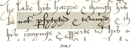
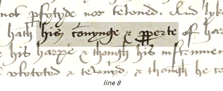
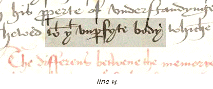
This is a very good example of an early sixteenth-century hand and it is worth spending time comparing its different letter forms to those for later periods given in our alphabets, or to those of one of our early Elizabethan manuscripts. Use our description of this hand as a pointer to some of its noteworthy features. In most respects this style of early Tudor secretary hand is simpler in appearance, though not necessarily more legible, than later secretary hands. But it is also less cursive, and less confident and elegant than the more swashing of later styles. The impression of legibility is offset in this document, as in others of its period, by its spelling (e.g. 'sciens' for science, 'properte' for property), which makes reading it slower than should be the case, except for those familiar with late middle English or with early sixteenth-century texts.
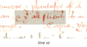
If editing such a manuscript for print, the coloured ink would present a problem. How can a printed text adequately represent this effect? In fact the earliest printers tried to find ways of mimicking the manuscript usage of red ink in print, though the effort was largely abandoned since no method not extremely labour-intensive could be discovered. A modern edition might settle for a single colour reproduction to give a glimpse of the manuscript, but even this is unlikely. In such a case the web edition has a distinct advantage, since colour adds no cost either to photographic images or to typography.
Close this window to exit the test.
|
|
|
|
|
|
|
|
|
|
|
|
|
|
|
|
|
|
|
|
|
|
|
|
|