Discussion of the controversial privatisation of Royal Mail – and what this will mean for those sending, sorting, and delivering letters – rumbles on in the newspapers. On a happier note, the Guardian yesterday featured an album of pictures of things from the British Postal Museum and Archive, which is hoping to raise enough funds to open a museum in London by 2016. These artefacts, including a telegram announcing the sinking of the Titanic, and a photograph of the Beatles opening fan mail, are suggestive of the rich mine of material texts in this archive – and when Royal Mail is no longer in public hands, a museum will be an important monument to this centuries-old institution.
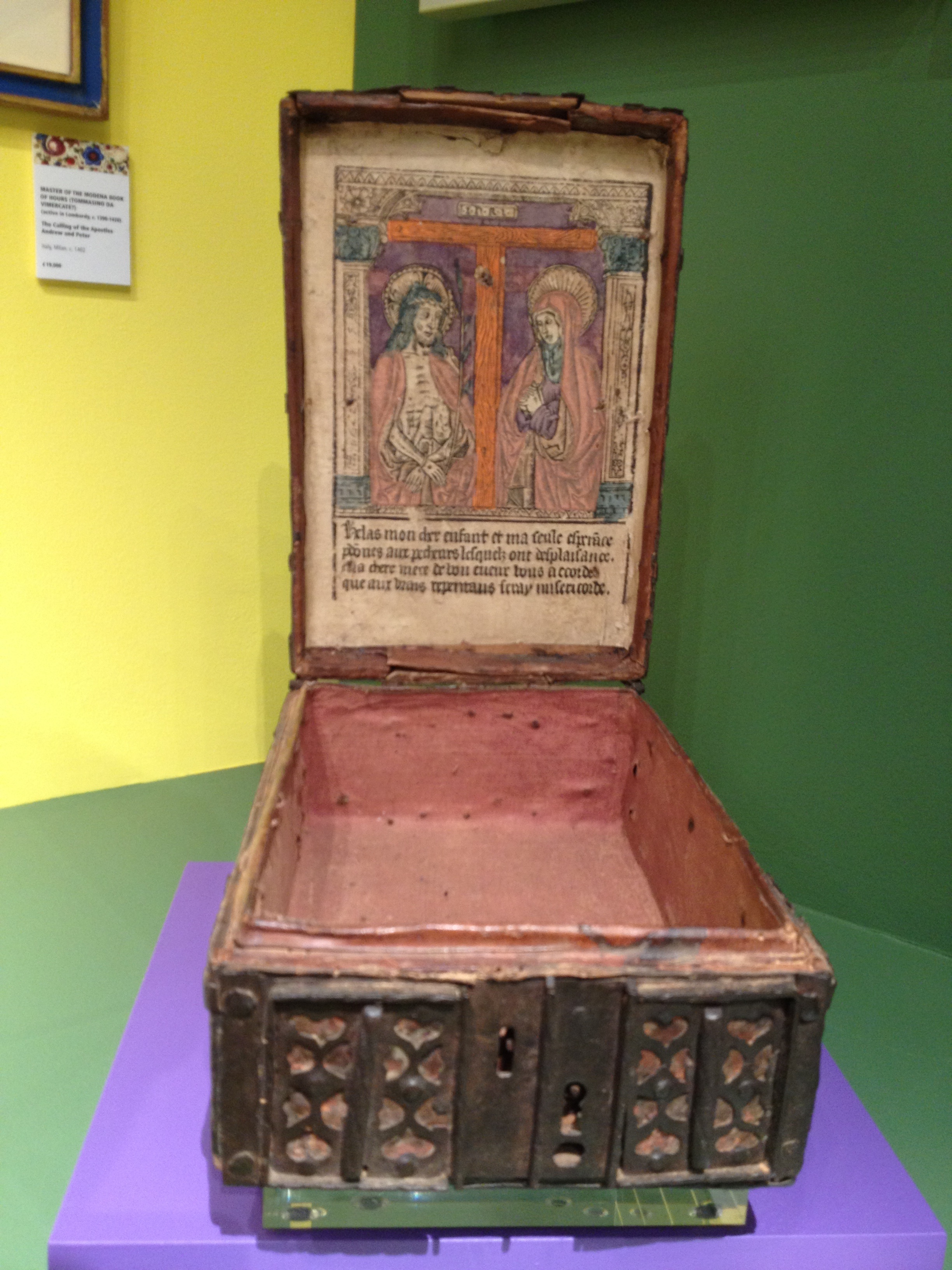
I came across this early sixteenth-century French ‘coffret’ earlier this week, amongst many other treasures at the 2013 Masterpiece fair . The lid is lined with a woodcut image of Christ as the Man of Sorrows, standing with the Virgin Mary at the foot of the Cross.
What was this box used for? It appears book-sized, as though it could have held a prayer book. But it clearly has a devotional purpose in itself, exposing a colourful image to be meditated upon. Jason has alerted me to a wonderful auction catalogue of further examples of these intriguing objects (all of them French) and I shall investigate further – though sadly, at tens of thousands of pounds each, I won’t be buying one any time soon!
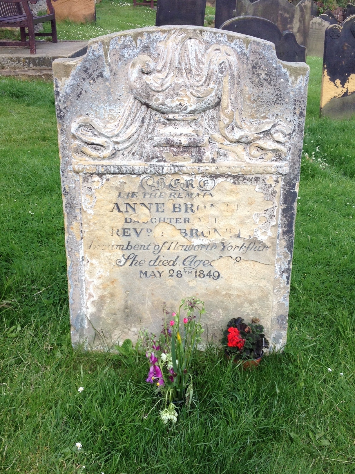
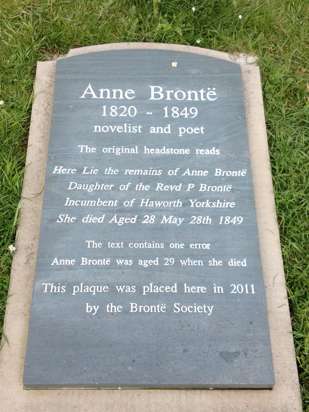
In a graveyard on a hill overlooking the harbour in Scarborough, North Yorkshire, a headstone marks the burial site of Anne, the youngest Bronte sibling, who died while seeking recovery from tuberculosis in the coastal resort. The original stone, now somewhat eroded, claims that ‘She died Aged 28/ May 28th 1849’. In 2011 the Bronte Society placed another stone next to it, pointing out that ‘The text contains one error’ – Anne was in fact 29 when she died (her birthday being 17th January 1820). Anne’s sister Charlotte apparently discovered multiple errors when she visited the grave three years after her death, and the stone was then refaced, but with this mistake remaining, uncorrected until now.
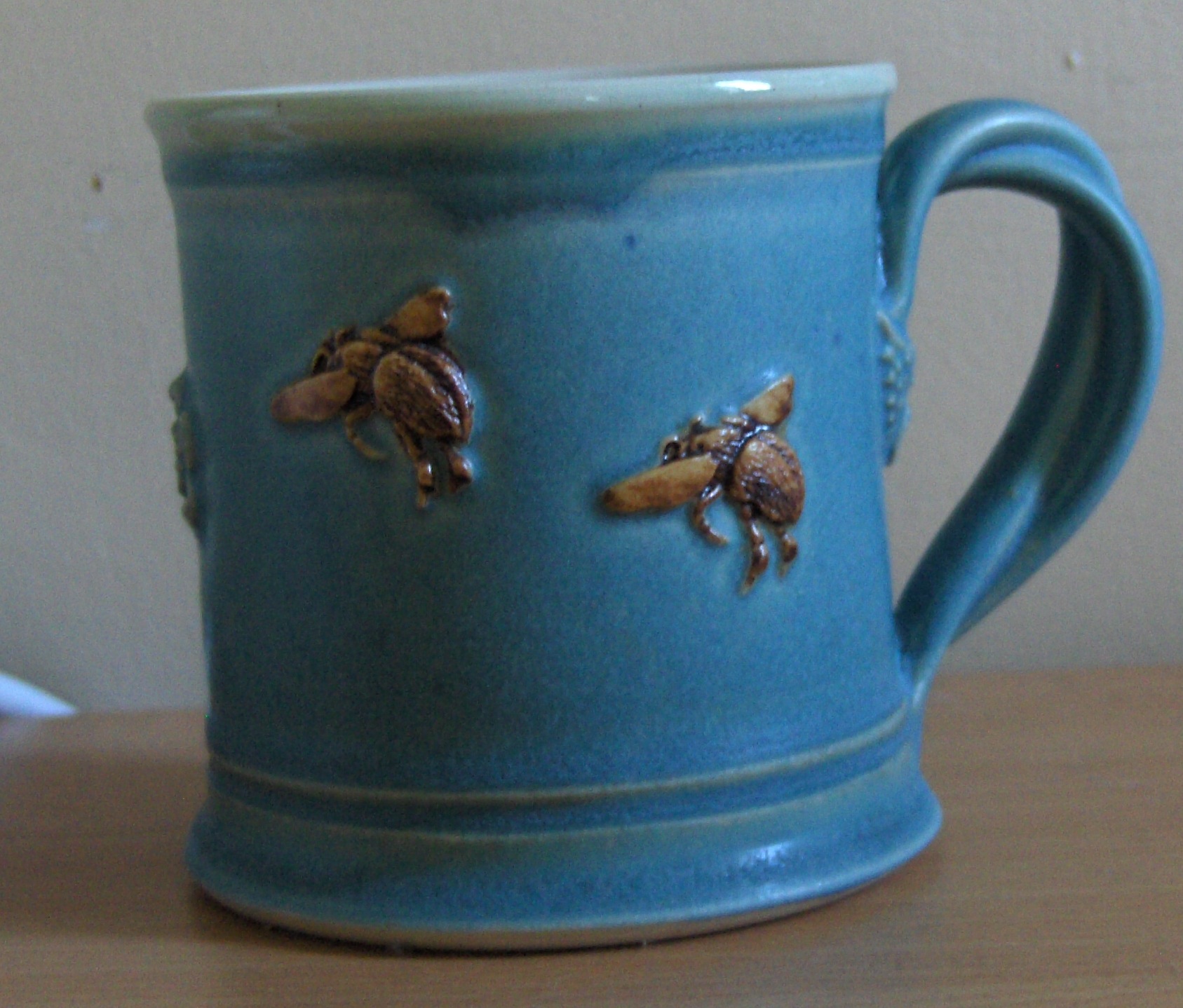
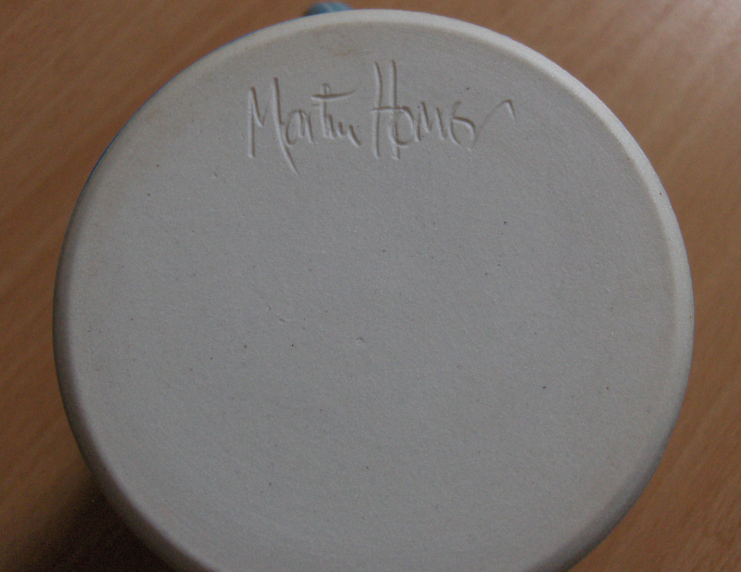
Above: stoneware mug by Ludlow potter Martin Homer, signed on the base by the artist
At a seminar last week organised by the Material Culture Lab in the department of Archaeology in Cambridge, four speakers offered some thoughts on what ‘material culture’ means in their discipline. Amongst them was classicist Robin Osborne, who mentioned his recent work on artists’ signatures on statues, vases, and other objects. I tracked down his article, ‘The Art of Signing in Ancient Greece’ (Arethusa 43 (2010), 231-51), in which he offers a window onto some ancient Greek material texts. Lately I have been thinking a lot about the title-pages of early modern printed books, and found Osborne’s articulation of the ways in which writing itself ‘attracts writing’ (p. 243), as well as his discussion of what the relative size and position of artists’ names and other texts on Acropolis column dedications, gravestones, and drinking cups might tell us about the interactions between the various agents involved in their production, to be surprisingly pertinent.
Below: frontispiece and title-page of Alexander Pope’s translation of Homer’s Iliad

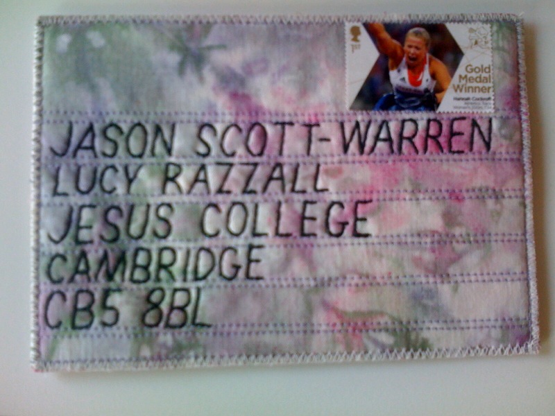 The organisers of last September’s CMT ‘Texts and Textiles’ conference were touched to receive this stitched postcard (left; apologies for the blurry photo) from one of the participants shortly afterwards. I was reminded of this lovely thank-you note today after reading the latest blog post from Edinburgh-based writer and designer Kate Davies, in which she shares some beautiful pictures of her collection of machine-embroidered postcards made in France and Switzerland in the early twentieth century. As Davies explains, these sentimental greetings cards were especially popular with British troops serving in France, and surviving examples with their handwritten inscriptions offer poignant glimpses into lives from the past. Unlike the postcard above, these mass-produced material texts were not stamped and sent in the regular postal service, but transported in military mail pouches, and so were more protected in transit. The delicacy of their voile overlays and the bright colours of their jolly floral designs reinforce their optimistic stitched messages (‘A KISS FROM FRANCE’; ‘We are all right’), and must have offered a striking contrast with the bleakness of the front line.
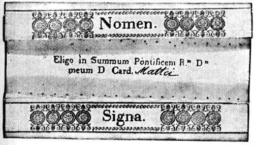
… has to be this, a Papal Conclave ballot paper. I’m not sure how old it is (over the centuries there have been several high-profile Cardinals by the name of Mattei) but it appears mysteriously to have escaped the flames of the Sistine stove…
Habemus Papam Franciscum!
Will it be today? While 115 Cardinals have gathered in the Vatican to choose the next Pope, all eyes are on the special chimney erected on top of their meeting place, the Sistine Chapel. After each ballot, all the ballot papers are burned in a stove, which will emit black smoke if no majority has been reached, and white smoke if a new pontiff has been chosen. Because the colour of the smoke can sometimes be ambiguous, a bell also rings when white smoke is issued. In 2005, Pope Benedict XVI was chosen very quickly, in less than 24 hours. Last night a great cloud of black smoke was seen, signalling an inconclusive first vote – how many more rounds of ballot papers will be burned this time?

If you have been to the new Alison Richard Building on the Sidgwick Site in Cambridge, you will probably have seen the three vitrines filled with porcelain by the potter Edmund de Waal, which are sunk below the paving just outside the entrance. Inside the building, there is another piece by de Waal: atlas, a wall-mounted vitrine divided into multiple shelves, on which are 120 lids from vessels he has made and broken because they were ‘not quite right’. Yesterday, I picked up a beautifully produced leaflet about these works, in which de Waal writes movingly about his motivations. Of the wall-mounted vitrine (pictured above, in the leaflet), which works so well in the space it occupies, he says:
‘If the structure of the vitrine looks familiar, it is because it is a gentle echo of a manuscript page with texts, footnotes and commentaries in intimate conjunction.’
De Waal intended this and the other vitrines, he reveals, as ‘a kind of archive’, designed for a ‘site full of libraries and archives, and the people who care about libraries and archives’. Located at the threshold to the building, as well as at the heart of the building’s airy atrium, de Waal’s elegant vitrines remind us that our engagement with the materiality of pages, archives, and libraries, while often frustrating and challenging, can also be intensely beautiful.
One day over lunch last week, a colleague asked me if I had a spare copy of Jane Austen’ s Northanger Abbey that she could borrow for an undergraduate seminar she was teaching that afternoon. When I located it on my bookshelf, I realised it was full of my own undergraduate annotations. Oh, the embarrassment… By coincidence, I had been reading Michel Houellebecq’s The Map and the Territory, in which a version of the author himself meets a fictional artist, who wants to paint his portrait. In conversation with my colleague, I remembered this moment:
‘Jed took a few photos of the room as a whole. As he saw Jed approach the tables, Houellebecq suddenly became nervous.
‘Don’t worry, I won’t look at your manuscripts, I know you hate that. However…’ he thought for a moment, ‘I’d like to see what your annotations and corrections look like.’
‘I’d rather you didn’t.’
‘I’m not looking at the content, not at all. It’s just to have an idea of the geometry of it all. I promise you that in the painting no one will recognise the words.’
Reticently, Houellebecq took out a few sheets of paper. There were very few crossings-out, but numerous asterisks in the middle of the text, accompanied by arrows that led to new blocks of text, some in the margin, others on separate sheets. Inside these blocks, which were roughly rectangular, new asterisks led towards other blocks, forming a sort of tree diagram. The handwriting was slanting, almost illegible. Houellebecq didn’t take his eyes off Jed all the time he was taking pictures, and sighed with visible relief when he moved away from the table. On leaving the room, he closed the door carefully behind him.’
from Michel Houellebecq, The Map and the Territory, trans. by Gavin Bowd (London: William Heinemann, 2011) pp. 107-8.

Spotted in a pub in Suffolk…