fiction and olfaction

Blog;

Some clever people at the University of Antwerp chocolate letterhave discovered that shoppers will change their behaviour if the scent of chocolate is wafted through a bookshop. Apparently, people gravitate towards romances and the cookery section, becoming 3.5 times more likely to look at books in those categories, and 6 times more likely to buy them. But there’s no impact on the sales of crime novels or travel guides.

Clearly this is a research project that might run and run–is it really true, for example, that you are more likely to flog your house if you have brewed a pot of fresh coffee just before the prospective buyers arrive? But the results might also prompt us to reflect on the business of browsing–a word which can denote both open-ended shopping and a certain kind of semi-engaged skim-reading.

Moving through a bookshop we find ourselves browsing in both senses simultaneously, opening ourselves up to the variousness of the fare on offer in the books that we open up, exposing susceptibilities that can easily be swayed by subliminal signals like an unusual choice of font or a strange scent in the air. Browsing is a peculiarly heady experience, and one that keeps on drawing me back to real bookshops with all their smells and textures. Though if I catch myself buying any Mills & Boon, I may have to rethink…
In Fine Style

Blog;

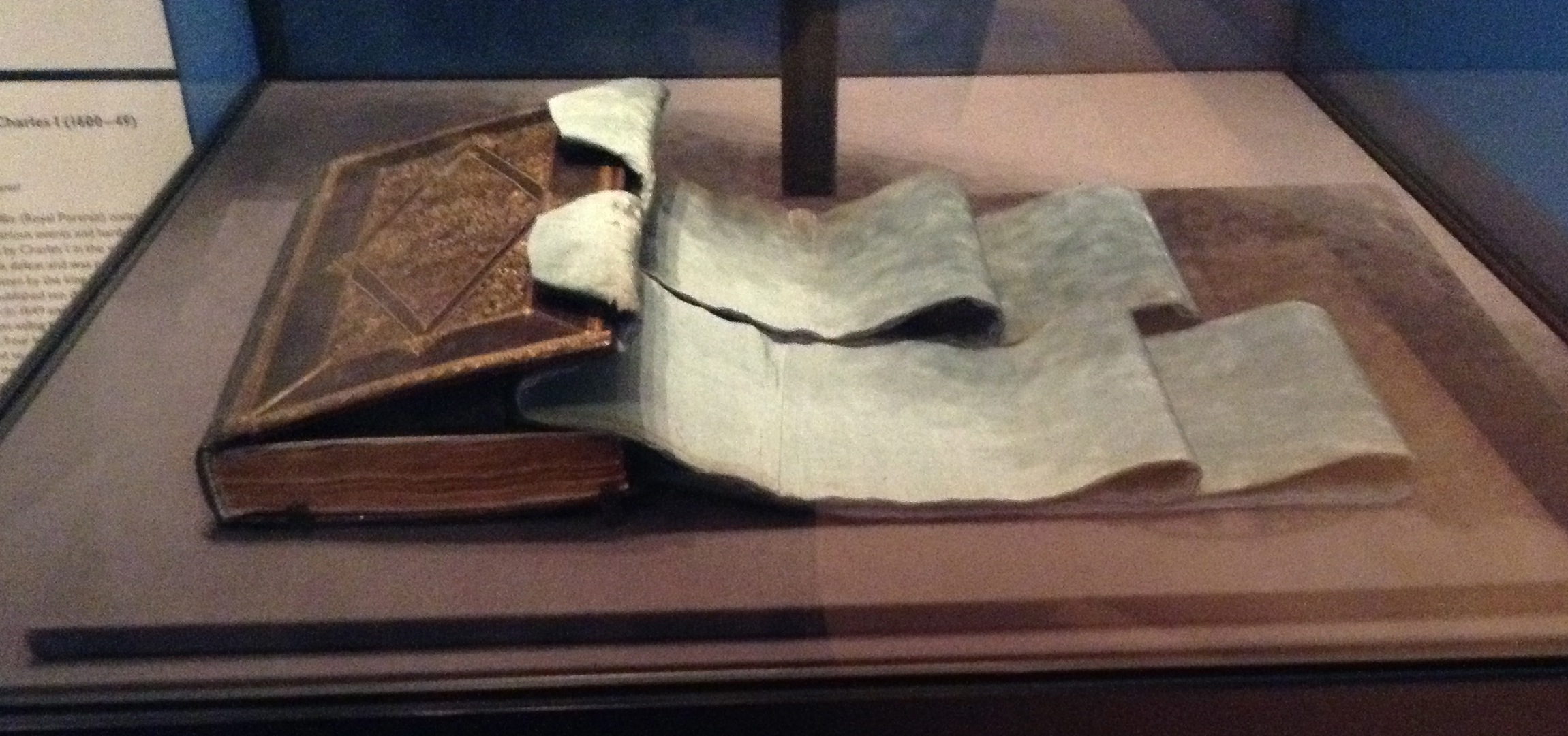
There are lots of wonderful things to see in the latest exhibition from the Royal Collection, In Fine Style, which explores English courtly fashions in the sixteenth and seventeenth centuries. Alongside the sumptuous portraits, suits of armour, and embroidered doublets sits this volume, a copy of the Eikon Basilike with blue silk ribbons attached to its binding:

IMG_0051

An inscription inside the book claims that this is the ribbon with which Charles wore his Order of the Garter medal. The Eikon Basilike was one of the most popular seventeenth-century printed works, published very soon after Charles’s death in January 1649 (the Royal Library alone holds around 70 copies). Its content encouraged the belief that Charles was a martyr, and its popularity was matched by a proliferation of relics associated with the executed king. Copies of the Eikon Basilike could often acquire relic status themselves, reportedly being bound with cloth dyed in the king’s blood, or in covers made from his hair. This unique object straddles the categories of book and relic, and you can see more photographs and read about its history in a Royal Collection essay about its conservation, found here on the exhibition website.

In Fine Style continues at the Queen’s Gallery, Buckingham Palace, until 6th October 2013.

the crystalline serif

Blog;

serifIn this week’s New Yorker Nicholson Baker has a long and fascinating piece about the history of the liquid crystal display that you are looking at right now. He traces its development back to the 1880s, when German scientists were studying the strange behaviour of cholesterol derived from carrots, and reporting excitedly on the existence of ‘flowing crystals! … The impossible here really seems to become possible’. Fifty years later a prototype LCD television had been patented, but it was decisively outgunned by the cathode ray tubes which dominated our living rooms from the 1950s onwards. ‘The bigger they got the heavier and boxier their containers were,’ Baker recalls, ‘(although they did give off a nice odor of baked dust when you sniffed the vents at the back)’. Finally the technology moved to Japan and Korea, where vast quantities of unthinkably sophisticated precision-engineering go into making the flat screens for our TVs, our cameras, our i-gizmos. Remarkably, the liquid crystals themselves still come from the same German firm, Merck, that started making them in the first decade of the twentieth century.

Baker tours the Korean factories and expos that allow him to glimpse the present and future of our glossy, hyperreal displays, and what really excites him are screens that threaten to annihilate pixellation–‘screens towards which we would be able to bend close, as we would to a printed page, and on which we would (almost) be able to read words the way they were meant to be read, not as stair-stepping digital approximation but as smooth, continuously curving shapes of meaning’. His yearning for ‘unblurred, crisply seriffed’ letters takes on extra significance in the pages of the New Yorker, a magazine dripping with its accumulated cultural capital, printed in a beautiful font on glossy paper, and so prim in its editorial standards that it insists on introducing a diaeresis (thank you, Wikipedia!) into words with ambiguously doubled vowels, such as ‘coöperate’ or ‘reëmerge’. All this extraordinary energy, and at the end of it we might have reinvented the wheel of ink on paper… Perhaps all it proves is that writers are not the people to ask about the future of LCD.

Correct Postage

Blog;

Discussion of the controversial privatisation of Royal Mail – and what this will mean for those sending, sorting, and delivering letters –  rumbles on in the newspapers. On a happier note, the Guardian yesterday featured an album of pictures of things from the British Postal Museum and Archive, which is hoping to raise enough funds to open a museum in London by 2016. These artefacts, including a telegram announcing the sinking of the Titanic, and a photograph of the Beatles opening fan mail, are suggestive of the rich mine of material texts in this archive – and when Royal Mail is no longer in public hands, a museum will be an important monument to this centuries-old institution.

riding and writing

Blog;

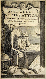
gelliusLast week I blogged about an old reading-and-riding exercise-chair at Belton House in Lincolnshire. Coincidentally, an article by Charles Nicholl in the Guardian on Saturday set about describing a different reading chair. No longer surviving today, this one belonged to the poet and playwright Ben Jonson. It is documented by the Restoration virtuoso John Aubrey, who reported having seen ‘[Jonson’s] studyeing chaire, which was of strawe, such as old woemen used’. Aubrey compared it with the chair shown in a picture of the Latin writer Aulus Gellius.

Further sleuthing allows Nicholl to establish that Jonson’s chair was on display for part of the seventeenth century in a ‘tippling house’ (The Jonson’s Head) on the Strand, where a poetaster pinned some rather lame verses above it, and the wits quipped that it signified ‘that Poets in these hard times, though they should invoke the nine Muses, may still want nine pence to purchase a pint of Canary’.

To some, all of this harping on a long-lost chair will seem fatuous. But scholars are increasingly turning to literary relics and souvenirs, both as a way of gauging the development of a writer’s reputation over time, and of charting changing ideas about the nature of the creative process. It would be nice to know what became of this particular seat of learning.

the economy and frugality of mystical plovers

Blog;

a post from Christopher Burlinson:

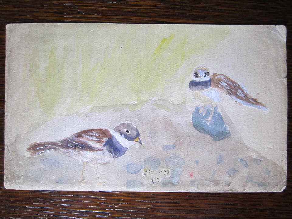
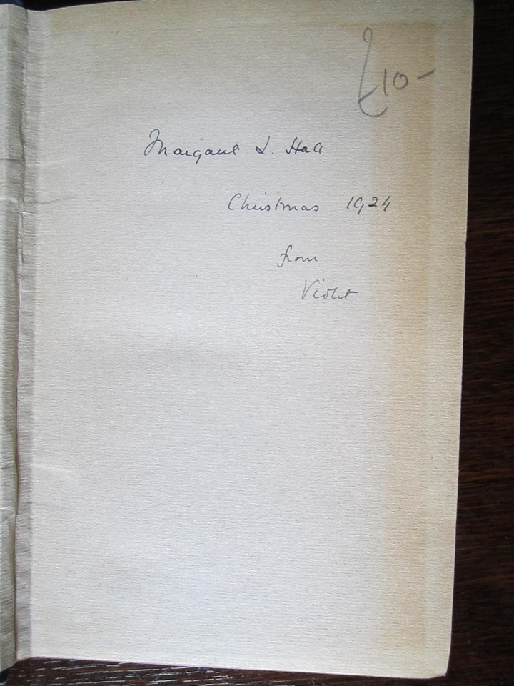
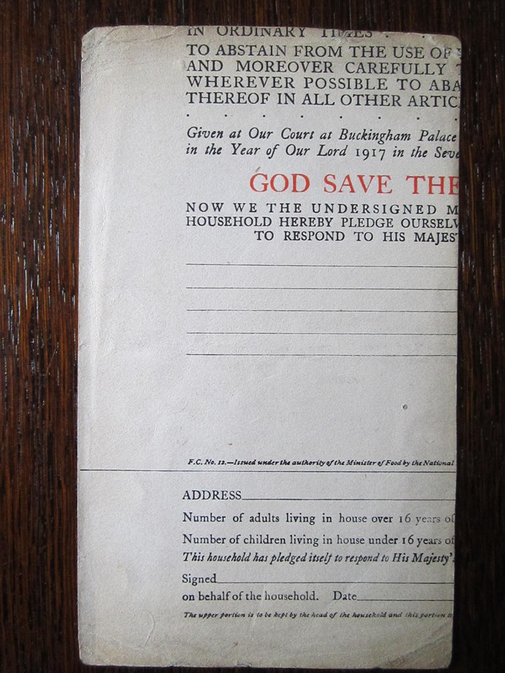
2ndhandbook2This little watercolour of a pair of ringed plovers, overseeing their clutch of camouflaged eggs, dropped out of a copy of The Oxford Book of English Mystical Verse (marked with an inscription, ‘Margaret L. Hall / Christmas 1924 / from Violet’) that I picked up in a second-hand bookshop in York. On the back, another text: a 1917 proclamation of King George V (‘issued under the authority of the Minister of Food’), instructing all heads of households ‘to practise the greatest economy and frugality in the use of every species of grain’ by reducing their consumption of bread by a quarter, and abstaining from the use of flour in pastry. It is printed on thick paper, presumably making it useful as artists’ material.

It was the plovers, I confess, and not the mystical poems, that made me buy the book.

2ndhandbook12ndhandbook3Who was Margaret Hall, though? Was she the painter of this watercolour? How soon after receiving the text of the proclamation did she decide to repurpose it—trimming it to the right size and painting a scene on the back? Was the proclamation already out of date? Did the painting have a life (on display? between the pages of another book?) between the day it was painted and the point at which Margaret used it to mark a poem? And why trim the proclamation before painting? Was Margaret perhaps copying the image from a book (which one?), and keeping to the same dimensions? Or was the image painted from her memory, or her imagination?

Blog;

photo(19)

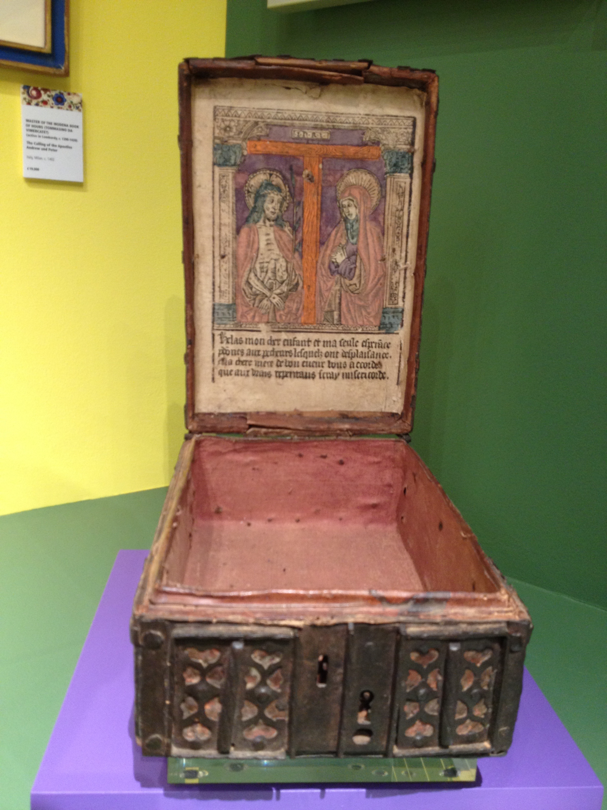
I came across this early sixteenth-century French ‘coffret’ earlier this week, amongst many other treasures at the 2013 Masterpiece fair . The lid is lined with a woodcut image of Christ as the Man of Sorrows, standing with the Virgin Mary at the foot of the Cross.

What was this box used for? It appears book-sized, as though it could have held a prayer book. But it clearly has a devotional purpose in itself, exposing a colourful image to be meditated upon. Jason has alerted me to a wonderful auction catalogue of further examples of these intriguing objects (all of them French) and I shall investigate further – though sadly, at tens of thousands of pounds each, I won’t be buying one any time soon!

Riding and reading

Blog;

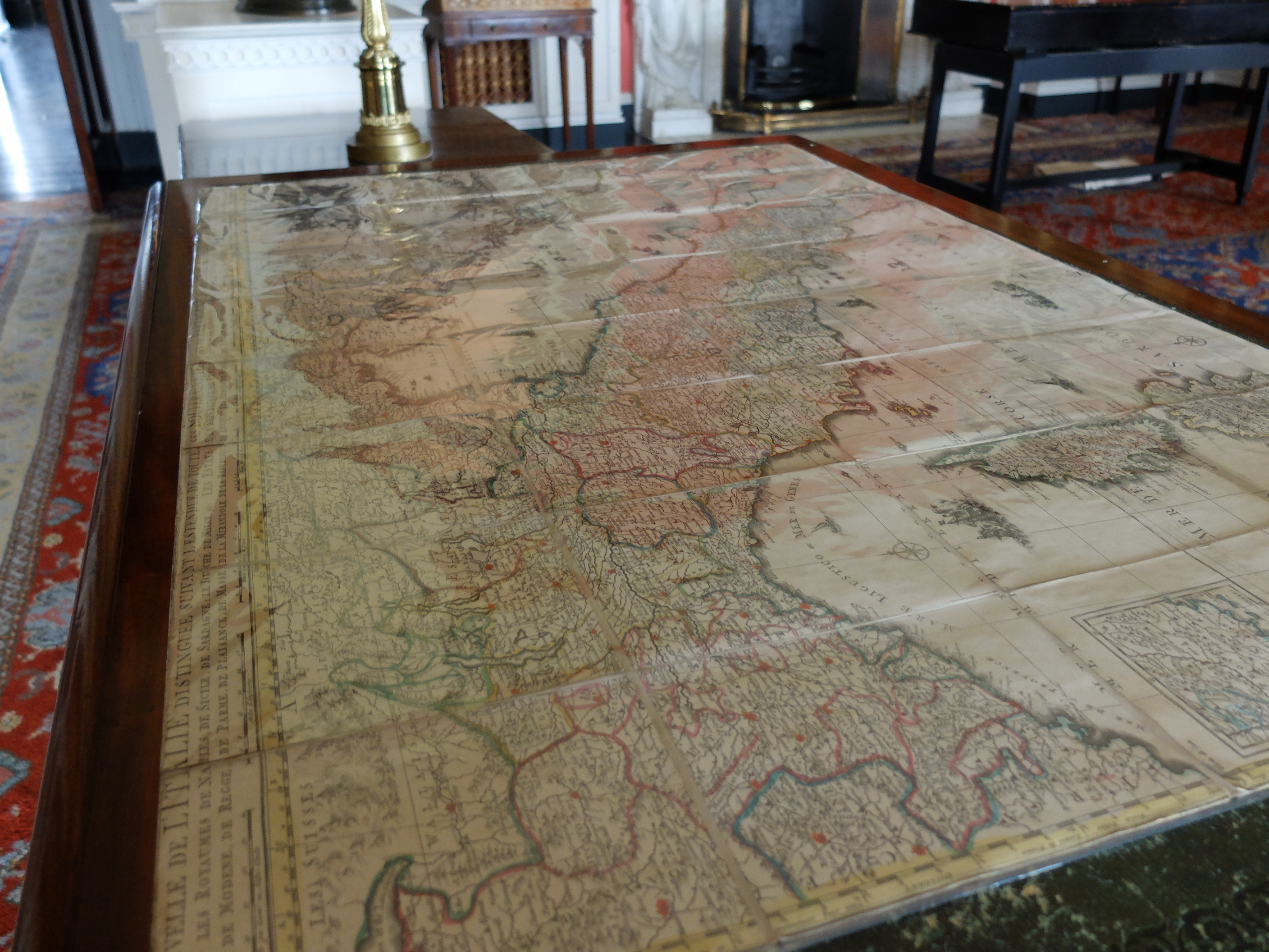
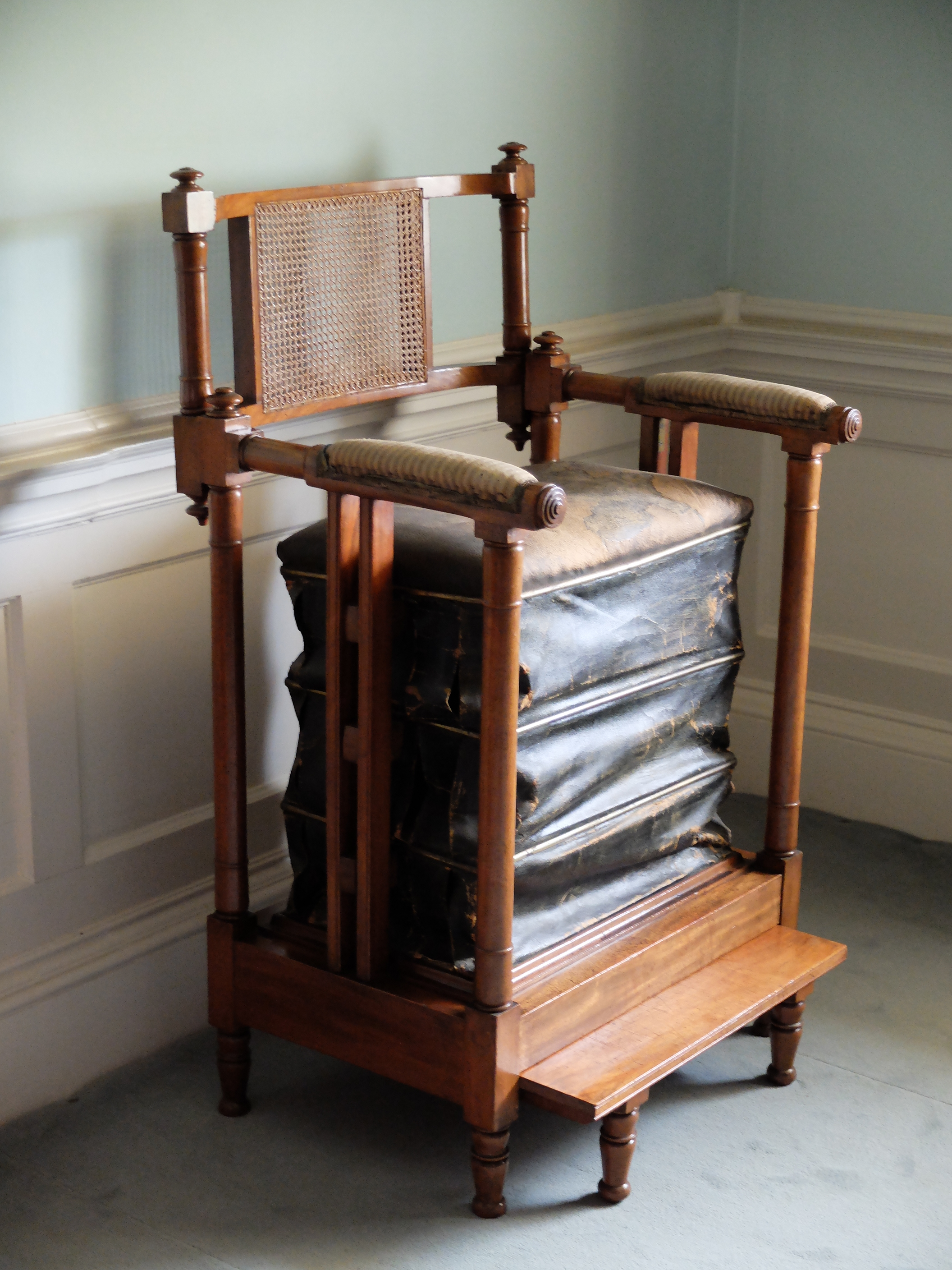
DSCF1103Last month, our members were treated to the first ever CMT coach trip: a site-visit to the Cambridge-curated exhibition at Belton House, Lincolnshire, which is displaying books and maps collected by several generations of the Brownlow family on their Grand Tours across Europe. Among the highlights was the reading/exercise chair shown below, which allowed its users to bounce up and down as if on horseback whilst working their way through Gibbon’s Decline and Fall or catching up on the latest Austen. A machine for creating the healthy mind in a healthy body, it even sat in the corner of a bedroom, like its modern equivalents. (Would we be right to guess that exercise bikes double up as places of reading for many of their users?)

For a new report on the exhibition, which runs until 3 November 2013, click here.DSCF1080  DSCF1087

errata in the graveyard

Blog;

photo(17) copyphoto(17)

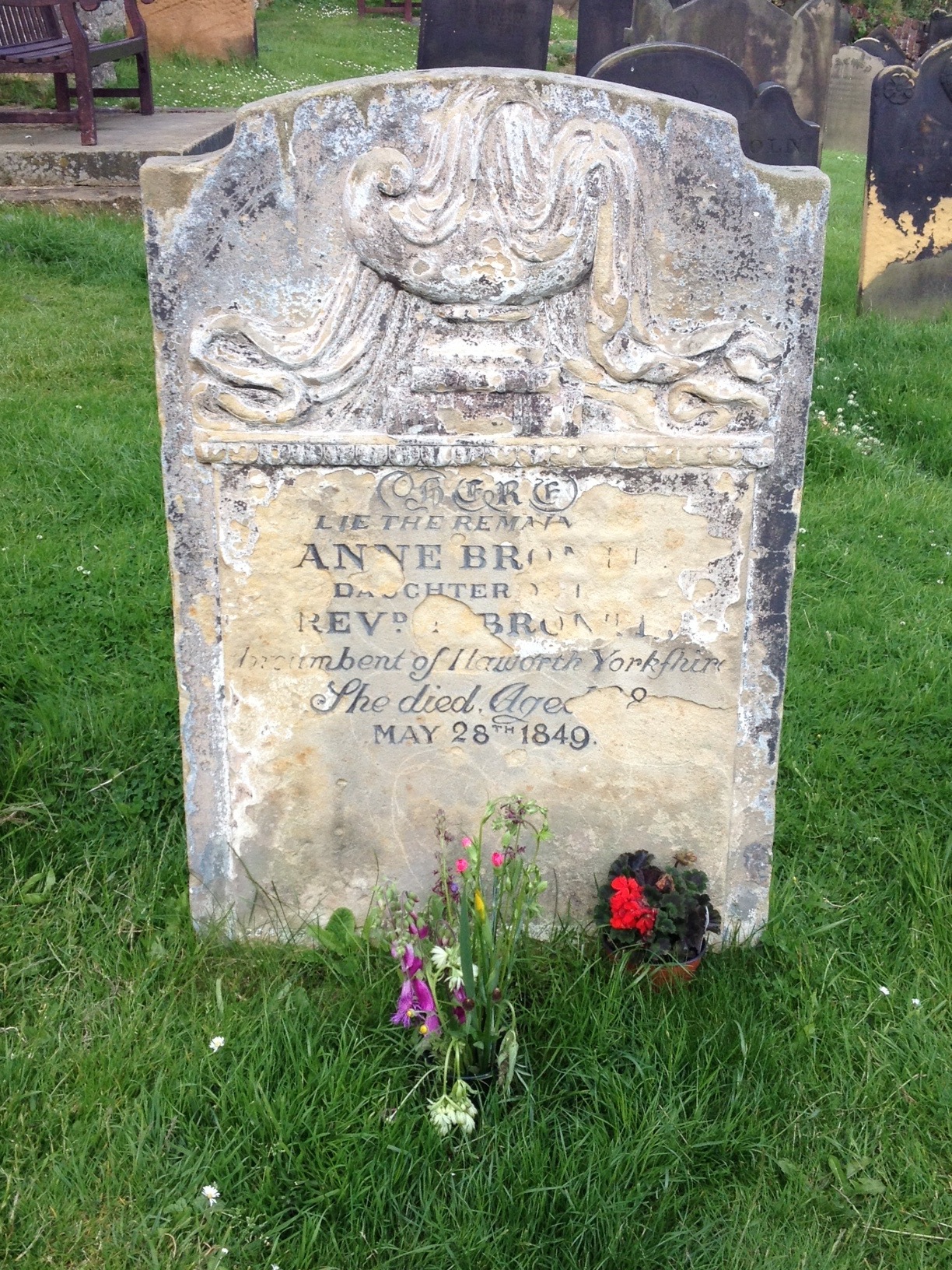
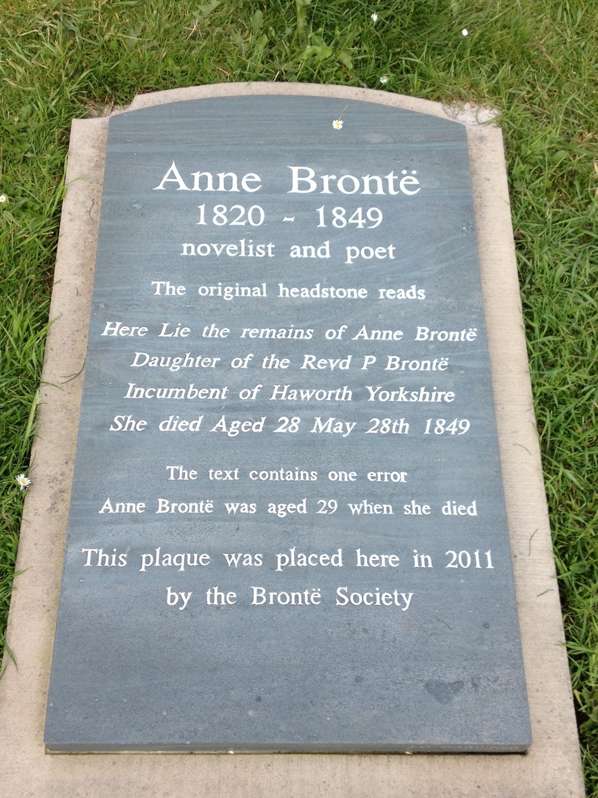
In a graveyard on a hill overlooking the harbour in Scarborough, North Yorkshire, a headstone marks the burial site of Anne, the youngest Bronte sibling, who died while seeking recovery from tuberculosis in the coastal resort. The original stone, now somewhat eroded, claims that ‘She died Aged 28/ May 28th 1849’. In 2011 the Bronte Society placed another stone next to it, pointing out that ‘The text contains one error’ – Anne was in fact 29 when she died (her birthday being 17th January 1820). Anne’s sister Charlotte apparently discovered multiple errors when she visited the grave three years after her death, and the stone was then refaced, but with this mistake remaining, uncorrected until now.

back to the future?

Blog;

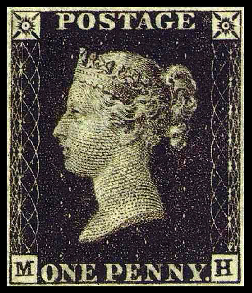
PennyBlackAs the whistleblower Edward Snowden leaks ever more information about global bugging operations — today it’s the US spying on the European Union, but a week or two ago it was the British government spying on participants in the last G8 summit — the question inevitably arises: how can you communicate securely in the modern world? And with that, the inevitable but somewhat horrifying answer — they are all going to have to start sending letters again. I hope the CIA has hung on to a kettle that it can use to steam them open.