‘To be still searching what we know not, by what we know’: Recovering the Lost Library of John Milton
September 13th, 2022Blog; Jason Scott-WarrenA report by Hannah Yip
This summer, I worked as a Research Associate on the pilot project, ‘Recovering the Lost Library of John Milton’, which was generously funded by the Cambridge Humanities Research Grants Scheme. This project sought to build upon Jason Scott-Warren and Claire M. L. Bourne’s discovery of John Milton’s copy of Shakespeare’s First Folio at the Free Library of Philadelphia, which gained significant media coverage worldwide and even served as the basis for one of the questions in an episode of Jeopardy! which aired on 17 May 2022.
I was given free rein to think about how I might approach the tracking down of the rest of Milton’s library in the short timeframe of eight weeks; a daunting task, given the wealth of scholarship on this topic by scholars such as William Poole, let alone the number of books that must have passed through Milton’s library during his lifetime.[1] Only nine volumes have been identified as belonging to Milton; many others have since been disputed or dismissed as spurious.[2] While it is not the place of this blogpost to rehearse the numerous scholarly conjectures on the immediate journey of Milton’s library following his death, it is suffice to observe that, as Scott-Warren and Bourne’s discovery has shown, there is no easy way to predict where Milton’s books may have ended up.[3]
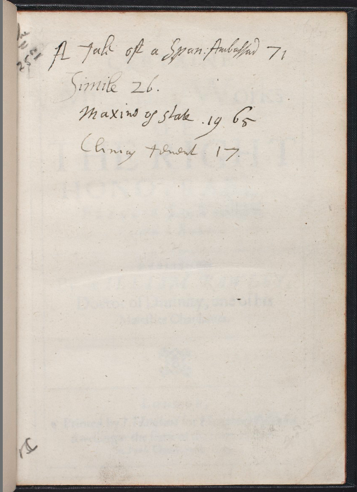
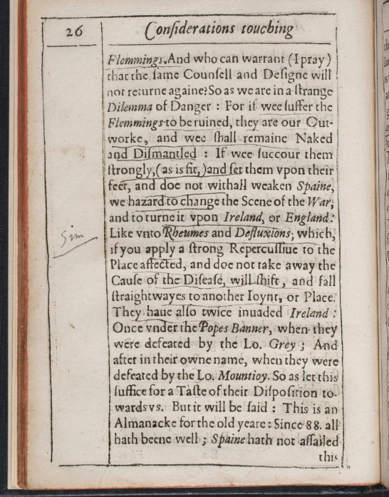
Former Research Associate, Taylor Hare (PhD candidate, Penn State University), laid the groundwork for my assignment in a number of ways, most notably by contacting numerous librarians in the UK and the USA in order to procure photographs of various annotated texts held in their collections which Milton had cited in his commonplace book (British Library, Add MS 36354). The principal caveat I was given before delving in was that I was only to investigate books published before 1652, the year Milton became blind. I began by thinking about the resources which were already available to me, starting with the invaluable digitised collection of annotated books at the William Andrews Clark Memorial Library, UCLA.[4] While the bulk of the Clark’s collections can be dated to 1650–1830, thereby mostly falling outside the remit of the project, there were a number of books which contained pre-1650 annotations, such as William Rawley’s Certaine Miscellany Works of The Right Honovrable, Francis Lo. Verulam (London, 1629) (PR2207.9 .C51 *). The Clark’s copy of this text contains a number of annotations throughout in several seventeenth-century hands. The rather half-hearted line accompanying the abbreviation ‘sim’ (i.e. ‘simile’) on page 26 bears some resemblance to Milton’s trademark ‘shoulder’ brackets to be found in his copy of Shakespeare’s First Folio, described by Scott-Warren and Bourne as ‘an often crudely executed, curved stroke’ (see Figures 1b and 2).[5] However, the ‘Simile 26’ on the flyleaf, which refers to this marginal note, is clearly not written in his hand; among other things, the ascender of the ‘l’ is too florid to be Miltonic (see Figure 1a).
After consulting the Clark’s digitised collection, my second task was to call up copies of various texts which Milton consulted, using the evidence from his commonplace book. This served as a concrete starting point, despite the fact that most of the nine surviving books owned by Milton are not actually cited in this manuscript.[6] I also chose two texts not listed in the ‘Primary Bibliography of Editions Used by Milton’ compiled by William Poole; namely, The Dippers dipt (London, 1645), a history of the Anabaptist movement since the Reformation, which was composed in prison by Daniel Featley, the Royalist theologian and controversialist; and the Royalist pamphlet, An Inquisition after Blood ([London], 1649), published anonymously by James Howell, which is cited in the second edition of Milton’s Readie and Easie Way to Establish a Free Commonwealth (London, 1660).[7] As a corollary to Poole’s observation that Milton ‘rarely took notes’ from pamphlet literature, in addition to scholarly conjecture that he may have stopped signing his books in the 1640s, it might be the case that Milton annotated these Civil War pamphlets instead; they would certainly have been cheap enough to own in abundance.[8]
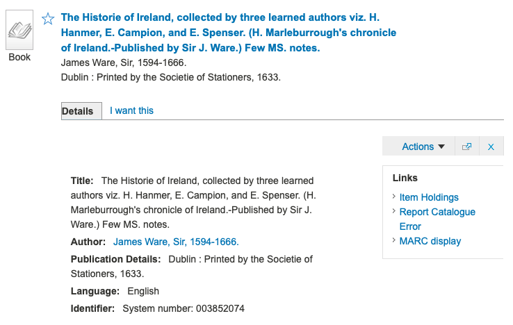
With regard to the texts listed in Poole’s ‘Primary Bibliography of Editions Used by Milton’, I would only call up specific editions identified with certainty as those which Milton consulted (for example, the 1545 edition of Roger Ascham’s Toxophilus).[9] Secondly, I would concentrate on copies about which provenance information was scarce or non-existent, in the hope that I might discover some uncatalogued marginal annotations and markings. Therefore, I did not examine copies of texts at archives such as Lambeth Palace Library which had already been identified as belonging to key contemporary figures of the Church, from Archbishop William Laud to Archbishop Gilbert Sheldon, which were unlikely to have passed through Milton’s hands.[10] In contrast, there were many examples within the British Library online catalogue which would specify the presence of ‘m. s. notes’, but with no further provenance information provided (see Figure 3). I also deemed it a worthwhile exercise not to rule out texts owned by individuals who had died within Milton’s lifetime; as Poole’s discovery of Milton’s copy of Giovanni Boccaccio’s Vita di Dante (Rome, 1544) has shown, Milton was not averse to buying copies owned by near contemporaries.[11] Furthermore, as scholars remain uncertain as to when Milton de-accessioned his books (if at all during his lifetime), I decided not to dismiss entirely the books of Robert Ashley, the translator and book collector who died in 1641, bequeathing all his books to Middle Temple.
Being based in London, I had the opportunity to travel easily to a wide variety of locations in search of Milton’s books. Many individual copies at libraries such as the National Art Library, the Institute of Historical Research Library, and the Special Collections at UCL Library are not catalogued on the ESTC or the USTC.[12] Drawing upon my familiarity with other archives beyond London, I also took the opportunity to travel much further afield to places such as Durham Cathedral Library. Having spent a month in Durham earlier in June to work on my own research, I was aware that the printed books at the Cathedral Library were yet to be catalogued electronically or linked to the USTC, meaning that it was likely that they had not been examined in great detail in recent years.
In the end, I found very little. Out of the 252 books I examined in July and August, 110 contained no annotations whatsoever. While Leah Marcus and Stephen B. Dobranski might be correct to some extent that ‘Milton’s hand was not all that distinct among Renaissance writers’, the way in which he annotated his texts is certainly distinguishable from many contemporary book owners.[13] Evidence of readerly engagement of any kind, if not Milton’s, was disappointingly conventional in many copies I examined; nor were there any instances of hand-colouring or drawings, or objects (or indeed the ghosts of objects) such as pressed flowers, scissor marks, or pins to be found.[14] I looked out especially for the curvy brackets which were such a key feature of the annotations in his copy of Shakespeare’s First Folio; his distinctive manner of keying his marginal annotations with asterisks (and latterly crosses); his use of ink rather than pencil; his adherence to an italic hand, as opposed to mixing secretary and italic forms; and his marked lack of underlining.
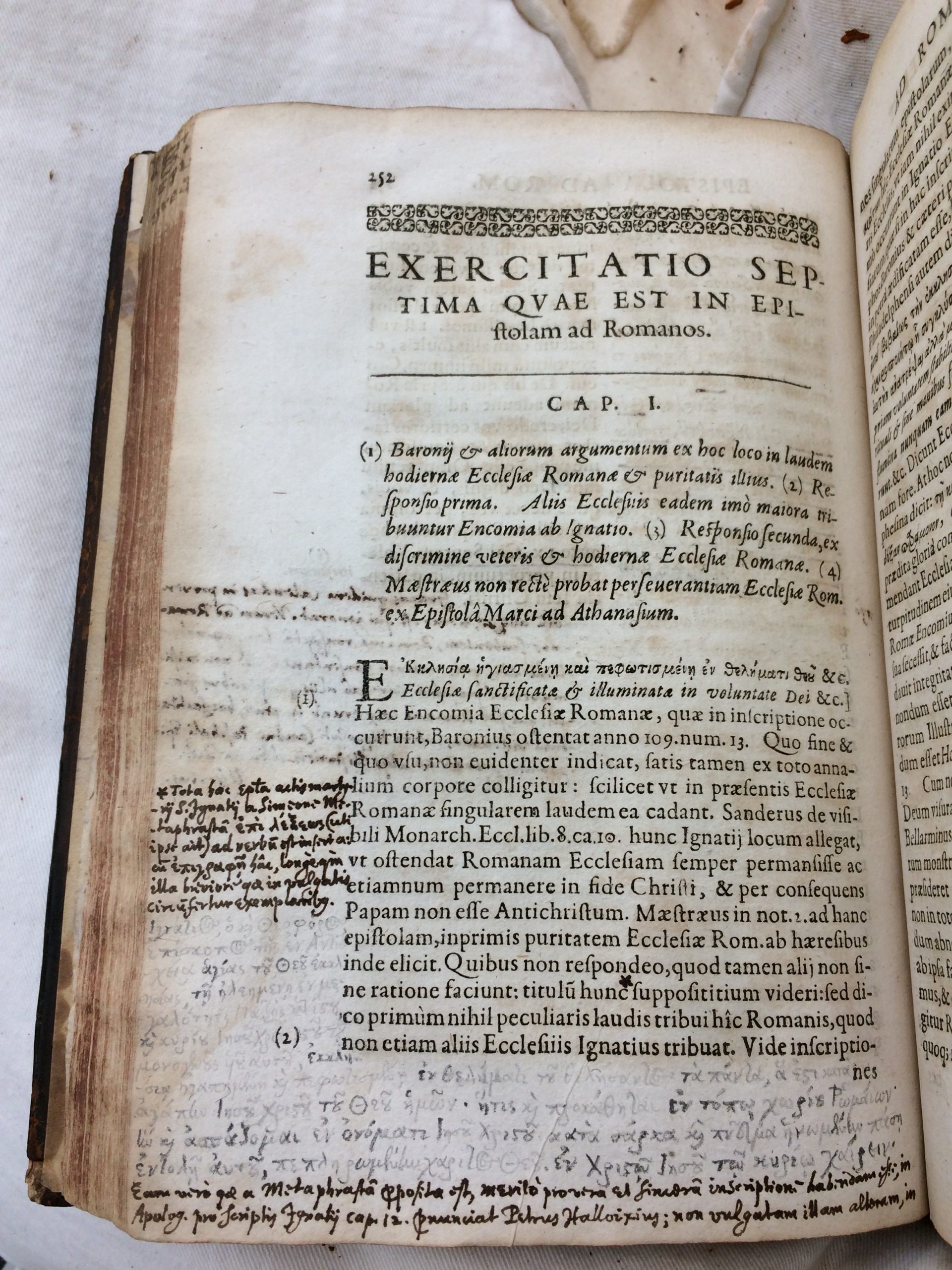
Perhaps the only copy I consulted which featured annotations remotely resembling Milton’s hand was Ignatius of Antioch’s Quæ extant omnia (Geneva, 1623), held at Durham’s Palace Green Library. This volume was previously owned by Martin Joseph Routh (1755–1854), a scholar of patristics and President of Magdalen College, Oxford, who bequeathed his large collection of approximately 16,500 printed books to Durham University. One ‘Nath. Walker’ and one ‘John Hilton’ (so close!) inscribed their names on the opening flyleaf; Hilton’s signature can also be found on the title page. Hilton had purchased the copy for 3 shillings and 6 pence, while Walker had bought it for 4 shillings and 3 pence. While it is difficult to identify these two individuals with certainty based on the names alone, it is possible, owing to the Durham connections and judging by the mid-to-late seventeenth-century italic hand, that Hilton was the John Hilton who was the son of John Hilton, Esq., of Monkwearmouth, County Durham. According to Venn’s Alumni Cantabrigienses, John Hilton the younger was born at Whitwhell House, County Durham, and was educated at Houghton-le-Spring. He was admitted pensioner, aged sixteen, at St John’s College, Cambridge, on 7 September 1635, but he did not take a degree. Admitted at Gray’s Inn less than three years later, he served as captain in the King’s service and succeeded his father at Hilton Castle. He was buried in 1670.
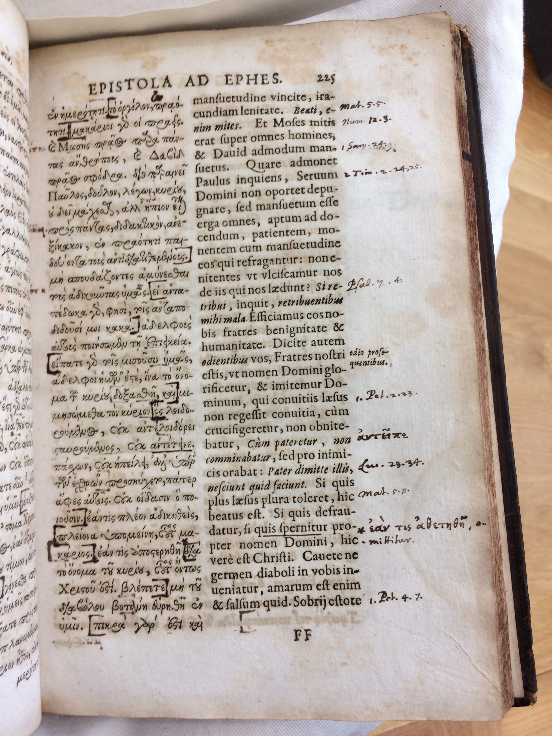
Durham University’s online catalogue gives no indication whatsoever of the sheer volume of marginal annotations in Latin and Greek on the pages of this copy, in no fewer than five different hands dating from the seventeenth and eighteenth centuries. I was struck especially by the way in which the annotator used asterisks and crosses to key certain words to marginal annotations, and the resemblance of many letter forms (including the capital letter ‘I’/’J’) to Milton’s (see Figures 4a–b and 5). The attribution falls short on account of the shape of the asterisks; Milton preferred a six-point asterisk, whereas the examples throughout this copy were consistently five-point asterisks. There is also rather too much variation in the execution of the ‘e’s; Milton only tended to use the italic ‘e’ and epsilon ‘e’, favouring the former in his later years, where the backwards secretary ‘e’ is also frequently in evidence.[15]
In any case, this summer has proved a valuable experiment in blue-sky thinking, bringing to the fore a number of practical questions. Milton’s appetite for reading was large, and scholars have long been aware of his active book-buying. How, then, might one continue to conduct a project of such scope? From an environmental perspective, it might be difficult to justify flights across the Atlantic to consult single copies of, say, The chronicle of Ihon Hardyng (London, 1543), held at Goucher College and the University of Wisconsin-Madison. An alternative option would be to email numerous librarians for photographs of annotations. This was more of a necessity than an option for my former colleague Taylor Hare, who worked on this project primarily from home in 2021 when libraries were operating restricted visiting hours. In addition to emailing librarians for photographs, Taylor also worked from digitised copies using Google Books and EEBO. As discussed earlier, this was an approach which I initially took when I examined heavily annotated copies of texts digitised by UCLA’s Clark Library.
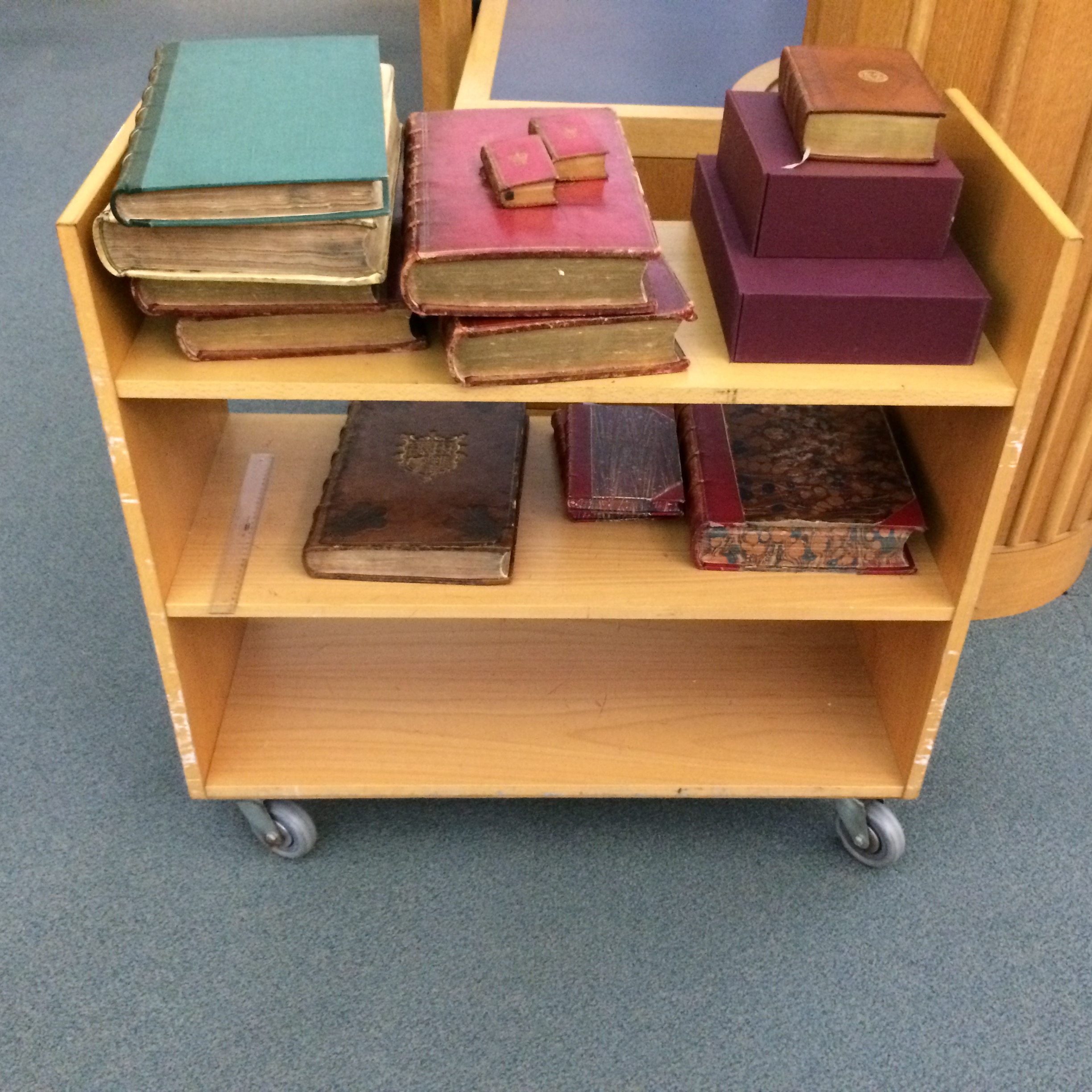
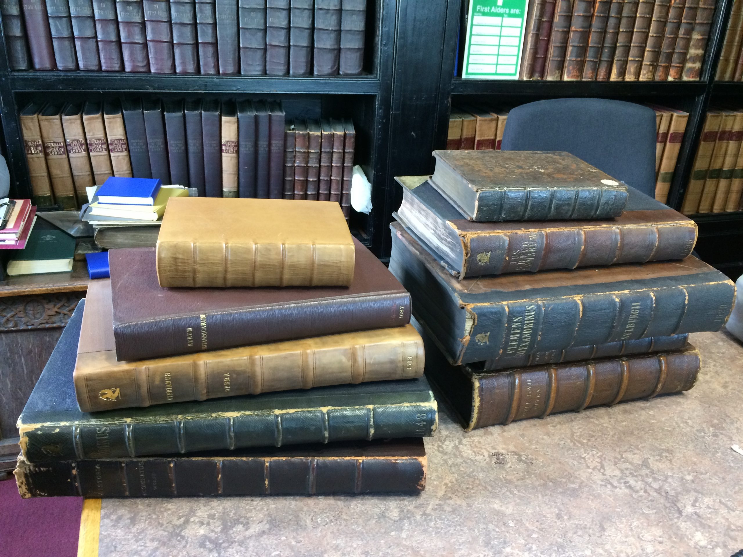
However, for such a project, one cannot rely on digitised images alone. In order to get a better sense of the types of books Milton was consulting, thinking further about the practicalities of owning such a library, one must give due consideration to the formats of the books (see Figures 6 and 7).[16] The standard catalogue descriptions of folio, quarto, and octavo fail to do justice to the variations in size within these three formats, and especially between books printed in England and those printed on the Continent. The smallest book I called up by far was Africæ descriptio IX lib. absoluta, trans. Joannes Florianus (Leiden, 1632) by Joannes Leo Africanus; the two volumes held at the British Library measure just 11 cm × 5.7 cm each, including the bindings (166.a.19. and 166.a.20.). It would have been very difficult to get a sense of the diminutive scale of these books by consulting digitised copies alone. On the other hand, the largest book I examined was Georgius Codinus’ De officiis magnæ ecclesiæ et aulæ Constantinopolitanæ (Paris, 1648). The John Rylands Library copy (shelfmark: 4973) measured 44.8 cm × 30 cm, including the binding. While current scholarship suggests that Milton spared little expense in buying books, the question remains as to whether Milton would have had the resources to own this particular book. Might it have been more likely that he consulted this particular tome in a library? Indeed, there appears to have been some reluctance by former owners to write in this very large book; there were no markings in any of the eight copies I examined.[17]
What other steps can we take to track down Milton’s books, and what other questions remain? It might be useful at this point to outline further a series of caveats and research problems. Firstly, it may be the case that Milton may have consulted certain books but not annotated them. Sharon Achinstein has already referred to numerous instances of ‘source-citing-but-not-reading’ in her exploration of the intermediary sources which he used to access the citations of Reforming worthies.[18] Perhaps there is a case to be made for Milton ‘reading-but-not-annotating’, or collecting books which he never got around to reading, storing them away in chests.[19]
Secondly, as my research in London alone showed, we remain restricted by various gaps in the databases available to us; the ESTC and USTC does not list every known copy of the texts which are available in public libraries. To provide one final example, the USTC states that there is only one public copy of the Codinus mentioned above – at the Bibliothèque Nationale de France – when in fact Oxford alone holds thirteen copies, and WorldCat lists a considerable number of copies held worldwide. It is also possible, of course, that Milton’s annotations could lie in books which are currently in private hands.
Thirdly, it would be useful to build upon the invaluable work of Peter Beal’s Catalogue of English Literary Manuscripts (CELM) by drawing up a full list of presentation copies of Milton’s own works which may have been annotated by him.[20] I was unable, for instance, to examine an annotated presentation copy of Areopagitica, owing to its inclusion in the British Library’s ‘Breaking the News’ exhibition (22 April 2022–21 August 2022).[21] The process of investigating potential presentation copies to confirm their authenticity or to relegate them to the large collection of spurious books would enable us to further consolidate the idiosyncrasies of Milton’s hand and orthography. The tracking down of annotated books more generally might still prove to be a fruitful approach, in the likely scenario that such annotations have not been attributed; in which case, Henry Richards Luard’s Catalogue of Adversaria and Printed Books containing MS. Notes (Cambridge, 1864)for books at Cambridge University Library might possibly be instructive.
We need to continue tracking the citations and sources which informed Milton’s writings, published and unpublished. While it might take some dedicated sleuthing to determine the exact editions from which the epigrams on the title pages of his publications were lifted, one place to begin might be to locate the copies of works to which Milton responded, or works which influenced him heavily, including the published works of his friends.[22] The Ivdgement of Martin Bucer, concerning divorce (London, 1644) and Bucer’s De regno Christi (Basel, 1557) influenced the composition of Milton’s second divorce tract published in 1644. Perhaps Milton might have bought An Answer to a Book, intituled, The doctrine and discipline of divorce (London, 1644), as he responded directly to it with Colasterion ([London], 1645). In 1650, the Council of State ordered Milton to publish a direct reply to Claudius Salmasius’ Defensio Regina, Pro Carolo I ([Leiden], 1649); he duly produced Pro Populo Anglicano Defensio (London, 1651). And, of course, there is John Gauden’s Eikon basilike ([London], 1649), to which Milton responded with Eikonoklastes (London, 1649).
Finally, to turn towards issues which have yet to be addressed: while there has been a rich body of research debating Milton’s position on image debates in the long English Reformation, the question as to how Milton may have responded to images in books remains ripe for investigation.[23] One of the most beautifully produced editions which I called up this summer was Giacomo Filippo Tomasini’s Petrarcha Redivivus, Laura Comite (Padua, 1635), which contains numerous portrait engravings. It seems unlikely that Milton would have extra-illustrated his books, executed elaborate drawings, or combined the techniques of drawing and pasting to embellish them;[24] on the other hand, William Poole conjectures that he may have taken the pains to colour in his (untraced) copy of John Guillim’s A display of heraldrie.[25] At a later point in his life, Milton would complain about the price of illustrated books, stating that pictures were of no use to him as a blind man.[26]
Perhaps connected to such questions would be the question of Milton’s engagement with book arts. Once again, judging from the evidence we have, while we know that Milton kept his books in good condition and annotated them with care, it does not seem likely that he required elaborate bindings or decorated the fore-edges of his books. (I called up a copy of John Foxe’s Book of Martyrs (seventh edn, London, 1632) (Durham Cathedral Library, I.IV.33-35), simply because the binding was stamped with ‘I M’, but found no annotations other than ‘Ex dono Tho: Comber [Thomas Comber (1645–1699), dean of Durham] Dec. Dunelm 1694’ inscribed on the title pages of the first two volumes, with the ‘1694’ omitted in the third volume.) Moving from the material to the musical, it also remains to be seen as to whether Milton’s music books, shipped from his travels in Italy back to England in 1639, will ever be recovered.[27]
The mysterious whereabouts of Milton’s library has continued to fascinate academics, librarians, and bibliophiles for centuries. If I had more time on this project, I would have looked into various titles dating from the late seventeenth and early eighteenth centuries with the words ‘Bibliotheca’ and ‘Catalogus’ in them, in order to discover if any of the nine books owned by Milton were sold together as part of another person’s library. I would also have investigated each of the previous owners of Milton’s nine books, from the clergyman and biographer Thomas Birch (1705–1766) to Victor Rothschild, 3rd Baron Rothschild (1910–1990), thinking about how they may have acquired their books and whether any of these were de-accessioned during their lifetimes, and where the rest of their books were distributed after their deaths.
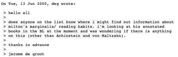
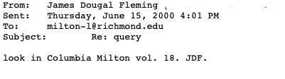
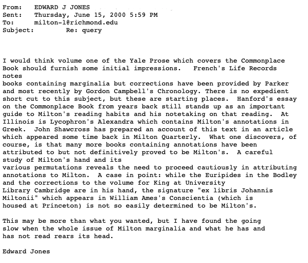
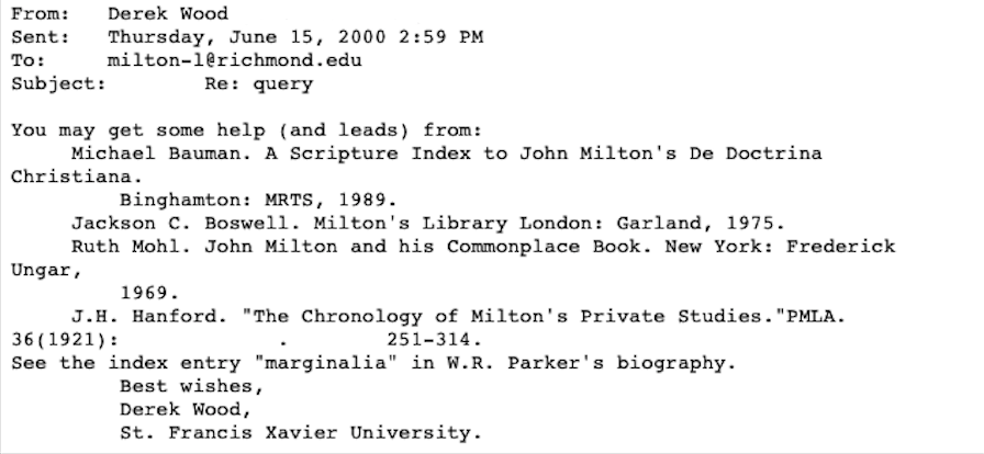
There are tantalising glimpses in secondary sources dating from the nineteenth century; while some of these need to be approached with caution, they are not to be entirely dismissed in every instance. It is very plausible, given Milton’s personal involvement in the Smectymnuans’ pamphlet debates with Joseph Hall, that his hand might be found in one of the many existing copies of the pamphlets arising from these disputes, as outlined in a late nineteenth-century Encyclopædia Britannica.[28] In an age of rapid digital communication, such searches have been instrumental in bringing together a community of Milton scholars worldwide; a Google search for the phrase ‘ex libris Johannis Miltonii’ brought up an intriguing conversation between Miltonists on the ‘Milton-L’ mailing list, which still exists on the servers of the University of Richmond in Virginia (see Figures 8a–d). But, in the continued quest ‘to be still searching what we know not, by what we know’ (Areopagitica, p. 30), it seems fitting to bring this blogpost to a close with an anecdote describing a potential Milton book in an antiquarian bookshop:
‘Once again, I [Madeleine Stern] believed I had found him at a bookshop in London’s St. John’s Wood during our annual buying trip. I quickly descended a ladder, a small calfbound volume in my hand, my eyes round with wonder, the book open to the title page. “Look at this!” I whispered dramatically to Leona [Rostenberg]. The sight that had stopped my breath was an ownership inscription inked on the margin of the title page: “Jn. Milton.” Could this, by the remotest possibility, have been a book touched, and read, and owned by John Milton? To us at the moment there was every likelihood that he had indeed written his name on the title page of Giovanni Marliani’s Vrbis Romae Topographia (Topography of the City of Rome). The book we held in our hands had been published in Venice in 1588 and was a guidebook, a kind of Baedeker, to the marvels of the Eternal City. It had been designed for the Roman tourist, and in the late 1630s Milton had been a tourist in Rome. What more likely than that he had purchased a guidebook during his visit and placed his name on its title page?’
Leona Rostenberg and Madeleine Stern sought out the opinion of Harris Francis Fletcher at the University of Illinois; following which, they were met with this response via a telephone call:
‘“This is Robert Downs, Director of the University of Illinois Libraries. […] It’s about that Milton signature […] Professor Fletcher wants me to tell you it’s an eighteenth-century forgery.”’[29]
THE AUTHOR
Hannah Yip is a Leverhulme Early Career Fellow at the University of Manchester.
APPENDIX: LIST OF LIBRARIES VISITED
Birmingham: Cadbury Research Library (University of Birmingham)
Durham: Durham Cathedral Library, Palace Green Library (Durham University)
London: British Library, Honourable Artillery Society Company, Inner Temple, Institute of Historical Research, Lambeth Palace Library, Middle Temple Library, National Art Library, Royal Society, Senate House Library, UCL Special Collections, Warburg Institute, Wellcome Collection
Manchester: Chetham’s Library, The John Rylands Library (University of Manchester)
Oxford: Christ Church, Magdalen College, The Queen’s College, Trinity College, University College
ACKNOWLEDGEMENT
I am grateful to Jason Scott-Warren, Claire M. L. Bourne, and Will Poole for their help with the copy of Ignatius of Antioch held at Durham. I also thank Jason and Claire for sharing their forthcoming Milton Quarterly article (‘“thy unvalued Booke”: John Milton’s Copy of the Shakespeare First Folio’) with me.
ENDNOTES
[1] See, for example, the output of William Poole, including William Poole, ‘‘The Armes of Studious Retirement’? Milton’s Scholarship, 1632–1641’, in Young Milton: The Emerging Author, 1620–1642, ed. by Edward Jones (Oxford: Oxford University Press, 2013), pp. 21–47;William Poole, ‘John Milton and Giovanni Boccaccio’s Vita di Dante’, Milton Quarterly, 48.3 (2014), 139–70; William Poole, ‘John Milton and the Beard-Hater: encounters with Julian the Apostate’, The Seventeenth Century, 31.2 (2016), 161–89; William Poole, ed., The Complete Works of John Milton, Volume XI: Manuscript Writings (Oxford: Oxford University Press, 2019). See also Edward Jones, ‘‘Filling in a Blank in the Canvas’: Milton, Horton, and the Kedermister Library’, The Review of English Studies, New Series, 53.209 (2002), 31–60. ‘Rediscovering the Lost Library of John Milton’ also seeks to revise the work undertaken by Jackson Campbell Boswell; see Jackson Campbell Boswell, Milton’s Library: A Catalogue of the Remains of John Milton’s Library and an Annotated Reconstruction of Milton’s Library and Ancillary Readings (New York, NY: Garland, 1975).
[2] See the subheading ‘Books from Milton’s Library’, CELM, <https://celm-ms.org.uk/authors/miltonjohn.html> [accessed 10 August 2022], although note that this list does not include William Poole’s 2014 discovery of Milton’s copy of Giovanni Boccaccio’s Vita di Dante Alighieri (Rome, 1544) (Bodleian Library, Arch. A f. 145) or the most recent discovery of Milton’s copy of Shakespeare’s First Folio by Jason Scott-Warren and Claire M. L. Bourne.
[3] See Poole, ed., The Complete Works of John Milton, Volume XI, p. 29.
[4] ‘Early Modern Annotated Books from UCLA’s Clark Library’, <https://calisphere.org/collections/26771/> [accessed 10 August 2022].
[5] See Jason Scott-Warren and Claire M. L. Bourne, ‘“thy unvalued Booke”: John Milton’s Copy of the Shakespeare First Folio’, Milton Quarterly (forthcoming).
[6] Edward Jones questions whether one should use Milton’s commonplace book as the starting point for discovering Milton’s books, arguing that he may not have made notes on the texts if he already owned them. See Jones, ‘‘Filling in a Blank in the Canvas’’, p. 59.
[7] J. M., The Readie and Easie Way to Establish a Free Commonwealth, 2nd edn (London, 1660), p. 15. For An Inquisition after Blood (London, 1649), see Alastair Bellany and Thomas Cogswell, The Murder of King James I (New Haven, CT: Yale University Press, 2015), pp. 452–53; Poole, ed., The Complete Works of John Milton, Volume XI, p. 26 n. 53.
[8] See Poole, ed., The Complete Works of John Milton, Volume XI, p. 24 n. 44.
[9] See the ‘Primary Bibliography of Editions Used by Milton’, in Poole, ed., The Complete Works of John Milton, Volume XI, pp. 416–22.
[10] For example, William Laud owned one of the Lambeth copies of John Selden’s De jure naturali (London, 1640), Main Collection SR1 Quarto, [ZZ] 1640.33, while the Lambeth copy of Nicetas Choniates’ Historia (Paris, 1647), Main Collection GH, KF550.N5 [*], belonged to Gilbert Sheldon. Marginal annotations do not appear to have been documented on the University of Manchester online catalogue, meaning that there are some important omissions, such as an unidentified seventeenth-century reader writing in Italian in a tiny hand on their copy of Bernardino Daniello’s commentary on Dante (Dante Alighieri, [La Divine Commedia] con l’espositione di M. Bernardino Daniello da Lucca (Venice, 1568), The John Rylands Library, Walter L. Bullock Book Collection, 613).
[11] Poole, ‘John Milton and Giovanni Boccaccio’s Vita di Dante’.
[12] The USTC does not record the National Art Library’s copy of Paolo Giovio, Opera quotquot extant Omnia (Basel, 1578), 86.A.11. Similarly, the ESTC does not record the Institute of Historical Research Library’s copy of Robert Ward, Anima’dversions of Warre (London, 1639), IHR ONSITE STORE (S/W.6110/War), or UCL Special Collections’ copies of at least four texts which Milton consulted, including Paolo Sarpi, Historia del Concilio Tridentino (London, 1619), STRONG ROOM B QUARTO 1619 S1. See the Appendix for the full list of libraries visited over the eight-week period.
[13] Stephen B. Dobranksi, Milton, Authorship, and the Book Trade (Cambridge: Cambridge University Press, 1999), p. 208 n. 46.
[14] Jane Giscombe, ‘The use of pins in early modern England (1450–1700)’, The Book & Paper Gathering (31 May 2018), <https://thebookandpapergathering.org/2018/05/31/the-use-of-pins-in-early-modern-england-1450-1700/> [accessed 19 August 2022]; Adam Smyth, ‘Book Marks: Object Traces in Early Modern Books’, in Early Modern English Marginalia, ed. by Katherine Acheson (New York, NY: Routledge, 2019), pp. 51–69.
[15] Ignatius of Antioch, Quæ extant omnia (Geneva, 1623), Palace Green Library, Durham University, Routh 2.D.3.
[16] On the physicality of some of these books, see Nicholas McDowell, Poet of Revolution: The Making of John Milton (Princeton, NJ: Princeton University Press, 2020), p. 357.
[17] For example, Nicholas McDowell believes that ‘it seems unlikely Milton carried the five massive volumes of de Thou [Jacque-Auguste de Thou, Historiæ sui temporis (Geneva, 1620)]’ back from Geneva to Horton, although he concedes that he may have purchased these texts in London. Edward Jones questions whether Milton would have even wanted to own the more extended works relating to church history and the Church Fathers; see Jones, ‘‘Filling in a Blank in the Canvas’’, p. 45. Other evidence appears to argue in favour for his priorities in finding a place sizeable enough to ‘dispose his Books in’; see John Milton, Letters of State, Written by John Milton (London, 1694), p. xx; Poole, ‘‘The Armes of Studious Retirement’, p. 28; Poole, ed., The Complete Works of John Milton, Volume XI, pp. 28–29.
[18] Sharon Achinstein, ‘Did Milton Read Selden?’, in A Concise Companion to The Study of Manuscripts, Printed Books, and the Production of Early Modern Texts: A Festschrift for Gordon Campbell, ed. by Edward Jones (Malden, MA: Wiley-Blackwell, 2015), pp. 266–93 (p. 272). See also Jeffrey Alan Miller on Milton’s references to John Foxe in ‘Reconstructing Milton’s Lost Index theologicus: The Genesis and Usage of an Anti-Bellarmine, Theological Commonplace Book’, Milton Studies, 52 (2011), 187–219.
[19] For Milton’s reading versus book use, see Nicholas McDowell, ‘Reading Milton reading Shakespeare politically: what the identification of Milton’s First Folio does and does not tell us’, The Seventeenth Century, 36.4 (2021), 509–25.
[20] See the subheading ‘Exempla of Printed Works by Milton with his Inscriptions or Additions’, <https://celm-ms.org.uk/authors/miltonjohn.html> [accessed 12 August 2022]. Some of this information can be found in the ‘Bibliography’ drawn up by Gordon Campbell and Thomas N. Corns in John Milton: Life, Work, and Thought (Oxford: Oxford University Press, 2008), pp. 446–55.
[21] John Milton, Areopagitica (London, 1644), British Library, C.55.c.22.(9.) (formerly E.18.(9.)).
[22] For example, Barbara Kiefer Lewalski describes how Milton may have owned copies of the poetry of his friend Alexander Gil. See Barbara Kiefer Lewalski, The Life of John Milton: A Critical Biography, rev. edn (Malden, MA: Blackwell, 2003), p. 56.
[23] David Loewenstein, ‘“Casting Down Imaginations”: Milton as Iconoclast’, Criticism, 31.3 (1989), 253–70; Daniel Shore, ‘Why Milton Is Not an Iconoclast’, PMLA, 127.1 (2012), 22–37; Antoinina Bevan Zlatar, ‘Milton Among the Iconoclasts’, in Making Milton: Print, Authorship, Afterlives, ed. by Emma Depledge, John S. Garrison, and Marissa Nicosia (Oxford: Oxford University Press, 2021), pp. 123–40. For an argument that Milton was a Ramist, ‘deeply influenced by the logic and method of the visual form of the dichotomous table’, see Katherine Acheson, Visual Rhetoric and Early Modern English Literature (Farnham: Ashgate, 2013), ch. 2 (quotation from p. 52). The John Rylands Library’s copy of the Bernardino Daniello commentary on Dante (Walter L. Bullock Book Collection, 613) features an engraved frontispiece of the Seven Circles of Hell which has been annotated by the anonymous reader.
[24] Jason Scott-Warren, ‘Cut-and-Paste Bookmaking: The Private/Public Agency of Robert Nicolson’, in Early Modern English Marginalia, ed. by Katherine Acheson (New York, NY: Routledge, 2019), pp. 35–50.
[25] It is conjectured by William Poole that Milton may have owned either the 1632 or 1638 edition of John Guillim’s A display of heraldrie.Poole, ‘‘The Armes of Studious Retirement’’, p. 28; Poole, ed., The Complete Works of John Milton, Volume XI, p. 252 n. 374.
[26] Letter from John Milton to Peter Heimbach, Westminster, 8 November 1656. See John Milton, Joannis Miltonii Angli, Epistolarum Familiarium Liber Unus (London, 1674), pp. 48–49.
[27] See Gordon Campbell, ‘Milton, John (1608–1674)’, Oxford Dictionary of National Biography, online edn <https://doi.org/10.1093/ref:odnb/18800> [accessed 12 August 2022]. William Poole admitted that Milton’s music books were beyond the remit of his study; see Poole, ed., The Complete Works of John Milton, Volume XI, pp. 22–23, 30.
[28] The Encyclopædia Britannica. A Dictionary of Arts, Sciences, and General Literature, 9th edn (Philadelphia, PA: Maxwell Sommerville, 1894), Vol. 16, p. 341.
[29] Leona Rostenberg and Madeleine Stern, Old Books, Rare Friends: Two Literary Sleuths and Their Shared Passion (New York, NY: Doubleday, 1997), pp. 184–85.
LIST OF FIGURES
Figures 1a–b. William Rawley, Certaine Miscellany Works of The Right Honovrable, Francis Lo. Verulam (London, 1629), William Andrews Clark Memorial Library, University of California, Los Angeles, PR2207.9 .C51*, <https://calisphere.org/item/ark:/21198/n1p88q/> [accessed 10 August 2022]. Flyleaf and p. 26.
Figure 2. Milton’s brackets in his copy of Giovanni Della Casa, Rime et Prose (Venice, 1563), New York Public Library, *KB 1529. Photo: Micha Lazarus.
Figure 3. ‘Few MS. notes’; a British Library catalogue description for James Ware, ed., Two Histories of Ireland (Dublin, 1633).
Figures 4a–b. Ignatius of Antioch, Quæ extant omnia (Geneva, 1623), Palace Green Library, Durham University, Routh 2.D.3, pp. 225 and 252.
Figure 5. Milton’s annotations in his copy of Lycrophon, Lycrophonis Chalcidensis Alexandra (Geneva, 1601), University of Illinois Library, 881 L71601, p. 156.
Figure 6. Books at the British Library. Included in this image are Joannes Leo Africanus, Africæ descriptio IX lib. absoluta (trans. Joannes Florianus) (Leiden, 1632), 166.a.19. and 166.a.20. (16o); John Hardyng, The chronicle of Ihon Hardyng (London, 1543), 673.e.1., 673.e.2., and G.5938 (8o); Francesco Guicciardini, La Historia d’Italia ([Geneva], 1636), 592.c.7., two volumes (4o); Johannes Leunclavius, ed., Iuris Græco-Romani tam canonici quam civilis tomi duo (Frankfurt, 1596), 504.i.2., two volumes (2o); and Samuel Purchas, Purchas his pilgrimes (1625), 213.d.2-5., four volumes (2o).
Figure 7: Books at Chetham’s Library. Included in this image are Clement of Alexandria, Opera Græce et Latine, ed. by Fridericus Sylburgius(Paris, 1629), E.3.4 (2o); Georgius Codinus, De officiis magnæ ecclesiæ et aulæ Constantinopolitanæ (Paris, 1648), Gg.28.9 (2o); Hieronymus Commelinus, ed., Rerum Britannicarum (Heidelberg, 1587), U.4.34 (2o); Cyprian of Carthage, Opera, ed. by Simon Golartius ([Geneva], 1593), E.3.13 (2o); Dante Alighieri, [La Divine Commedia] con l’espositione di M. Bernardino Daniello da Lucca (Venice, 1568), Byrom 2.K.7.58 (4o); Paolo Giovio, Opera quotquot extant Omnia (Basel, 1578), U.9.26 (2o); John Hardyng, The chronicle of Ihon Hardyng (London, 1543), Radcliffe 2.F.4.38 (8o); Johannes Leunclavius, ed., Iuris Græco-Romani tam canonici quam civilis tomi duo (Frankfurt, 1596), N.4.28 (2o); Nicetas Choniates, Historia (Paris, 1647), Hh.7.8 (2o); Joannes Benedictus Sinibaldus, Geneanthropeia (Rome, 1642), Q.9.46 (2o).
Figures 8a–d. Excerpts from the ‘Milton-L’ (University of Richmond) mailing list, dated June 2000, <https://facultystaff.richmond.edu/~creamer/milton/archives/2000/200006c.txt> [accessed 10 August 2022].