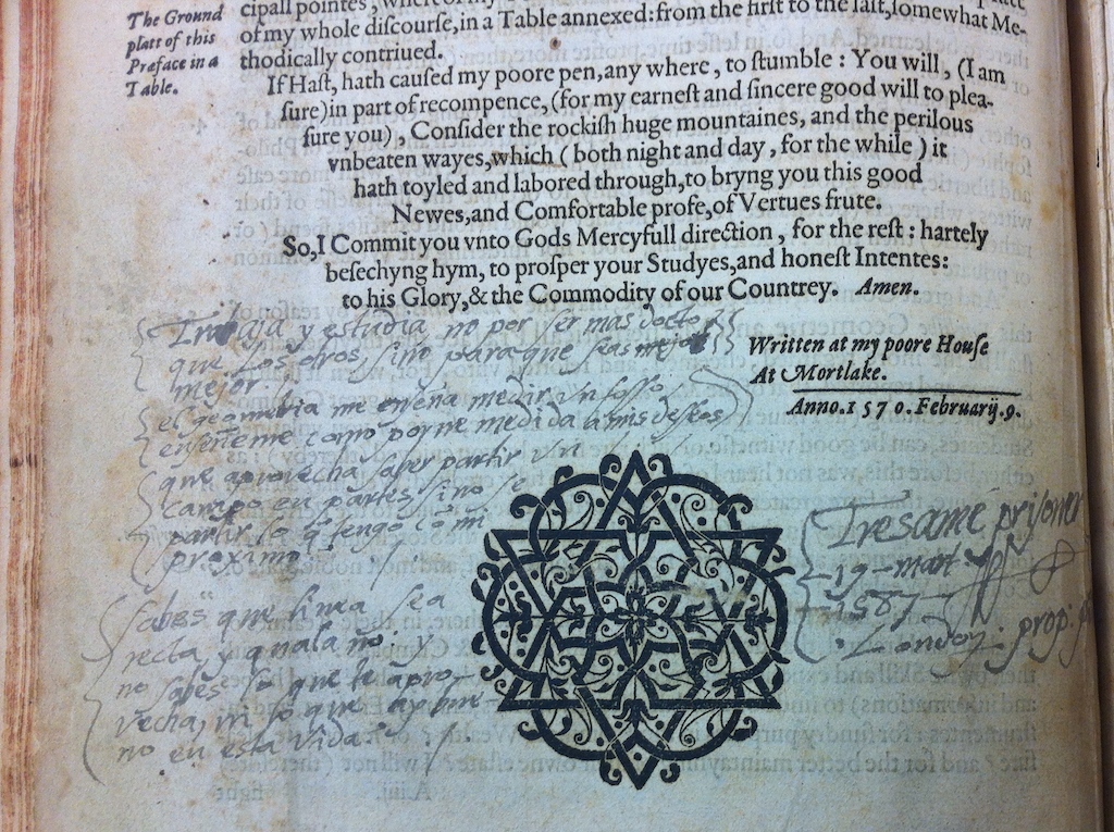
The first image in this blog post shows a page from a book published in 1713. In three volumes, it’s a collection of letters in the handwriting of a celebrity calligrapher called Hasegawa Myōtei. This page is part of a letter which, in heightened, literary language, advises someone to mend their bitter heart and be more like the willow tree which sways in the wind. The words vary between large and small, between thick rich lines and fine delicate ones; the forms are rounded and connected between letters and even between the vertical lines of text. The writing seems to drift downwards to the left, as if autumn leaves were falling in a gentle breeze.
This genre of publishing is called nyohitsu, the ‘woman’s brush’, and the books usually focus on letter-writing. The ‘woman’s brush’ extends to the style of writing which could also be used in commercial prose, and despite the name, it could be written by men as well as women. Nyohitsu was fashionable in the seventeenth and eighteenth centuries, with hundreds of books being published and republished, but it fell out of favour in the nineteenth century and is no longer practiced. Premodern Japanese script is almost completely illegible to most modern readers, so texts such as these that haven’t been considered important enough to transcribe are inaccessible to researchers, even when they are in the digital collections of libraries. In my research, my first challenge has been simply to learn to read them.
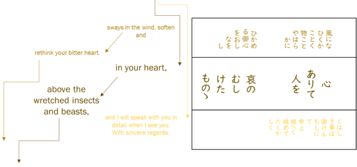
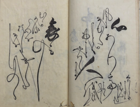
The next problem is the tension between what is on the page, and how I work with it. If I simply transcribe what I see page by page, it gives me fragments of phrases that don’t connect to each other, because the letter extends across the pages before and after in ways that we don’t expect and I can’t easily represent. Image 2 shows how I experimented with colour coding and arrows to follow how the reader moves backwards and forwards through the pages of the book. But while this helps illustrate how to interact with the text, it is unhelpful for a close reading of what the text actually says. For that, I still need to turn it into a readable, searchable, copy-and-pasteable typographic transcription.
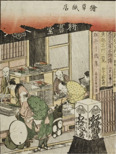
This process of typographic transcription is an ongoing project for scholars of premodern Japan, but we shouldn’t make the same mistake that early western visitors to Japan did. Early modern Japan had a vibrant and mature publishing industry catering to many different markets, including the women who were buying nyohitsu manuals or borrowing them from libraries. The third image shows a bustling shop full of customers browsing the illustrated books. However western visitors didn’t recognise this highly developed print culture, because Japanese books were floppy, stored on their sides, and they were woodblock-printed. We need to remember that woodblock printing was not a technological limitation, and moveable type was not a technological advance. Ceramic and wooden moveable type had been invented in China in 1040, and metal moveable type in Korea in 1250 a full two hundred years before Gutenberg in 1450. Moveable type was broadly unsuited for most applications of the character script shared by China, Japan, Korea and Vietnam, and woodblocks had advantages such as flexibility in combining text and image, and as the first image of the nyohitsu book shows, the ability to showcase the aesthetics of handwriting itself.
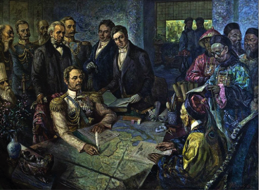
The shift from xylography to typography didn’t occur until the late nineteenth century, a period of huge change. The western powers had turned their attention to East Asia seeking new markets, and had shown they were willing to use force to get it. China’s ‘century of humiliation’ had already started with the loss of Hong Kong to Britain, and image 4 shows a treaty after their defeat by Russia. To avoid a similar fate, Japan urgently needed to be “modern” and “western”, and in the course of a few decades, Japan reorganised and revolutionised. This is the context for the shift to typography: all of the previous advantages of woodblock printing were now outweighed by the other imperatives.
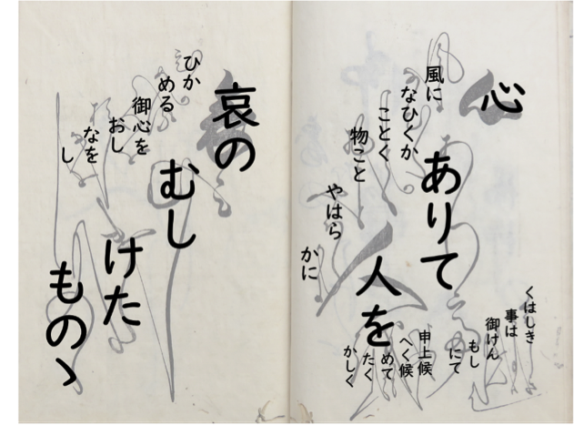
Nyohitsu’s nineteenth-century disappearance is likely to be a complex picture, but its incompatibility with typography is clearly implicated. Japanese script had to fit the demands of moveable type: the numbers of letterforms were cut down, variation was eliminated and letters were disconnected from each other. Typography aims for repeatability, as well as transparency: we shouldn’t be distracted from the content of writing by how it looks. We understand of course that if we change fonts we get different effects, but the message remains the same. What we see with nyohitsu is different. It might look like a font, but acts like a linguistic register. What it looks like contains important information, telling us something about the writer, the reader, and the relationship between them, as well as what kind of situation the interaction is happening in. Nyohitsu expressed affective qualities like warmth, friendliness, and intimacy. The manuals contained letters that said things along the lines of “As the autumn blows a cool breeze, the sky is bright and clear. I send my greetings on the festival of Tanabata.” This is not interesting for its content, but for the material expression of a relational gesture. In nyohitsu script, this could express friendly affection. The same message in a different script might be impersonal, frosty, or deferential. Using nyohitsu script to the wrong person could be over-familiar or disrespectful. The extravagant letterforms and elaborate page layouts are not decorative, but integral to the meaning. The final image is of something that looks like a nyohitsu page, but it has been stripped of meaning. As Marshall McLuhan’s famous aphorism goes, “the medium is the message”.
Nyohitsu resists typographic transcription because it has more to say than the limitations of typography will allow. Nevertheless, I continue to transcribe. Not only because modern literacy is typographic, but because, as McLuhan was pointing out half a century ago, we have built a world conditioned by typography – email, databases, WhatsApp, OCR, kindles, pdfs and the rest. As late nineteenth-century Japan realised, more than a medium, typography is a knowledge regime: only that which can be contained in typography counts as academic knowledge. That which that cannot be transcribed is not data. So I continue to transcribe, stripping nyohitsu of its meaning by repeating the process that led to its extinction in the first place. We are in an exciting moment when digital technologies like machine-reading and AI are allowing access to distant archives and research methods like distant reading, data-mining and corpus analysis. But at the same time, if we allow our digital future to be limited by typography, we are re-enacting what happened to nyohitsu: a new digital colonialism.
Helen Magowan
PhD Student
Faculty of Asian and Middle Eastern Studies
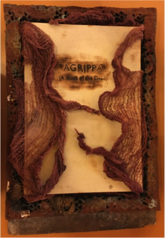

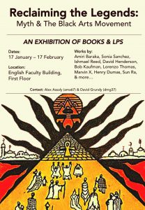 RECLAIMING THE LEGENDS: MYTH & THE BLACK ARTS MOVEMENT finds inspiration in the anti-historical world described by Wright. Its mysterious dance is the “cabinet of curiosities”: the defiance of categorical boundaries, the assembling of varied objects, the powerfully mythic rather than the historical, the rhythmic rather than the calculated. The exhibition also “plead[s]” like Wright’s dance. It asks visitors to abandon traditional epistemologies and participate in the microcosm it has created. This exhibition-world is a miscellany of anthropological & egyptological studies, revisionist histories, spiritualist & esoteric writings, books of poetry, and music record. It intimates some organizational principle, but finds time operating synchronically. Traditional chronology, here, is corrupted: Amiri Baraka, Sonia Sanchez, Lorenzo Thomas, Bob Kaufman, Ishmael Reed, David Henderson, and Marvin X appear alongside Gerald Massey, George James, and Theodore P. Ford. Like Wright’s dance, its form is ritualized and its theme is mythical.
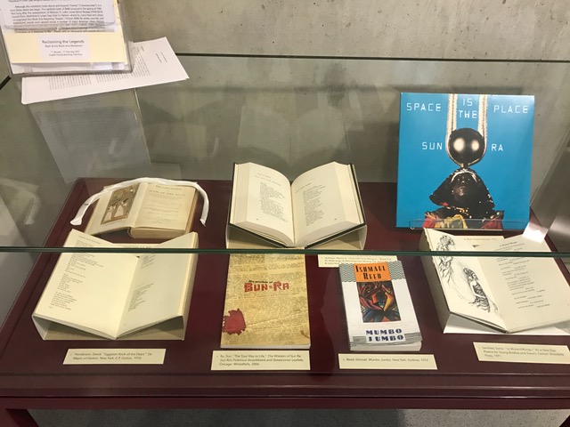
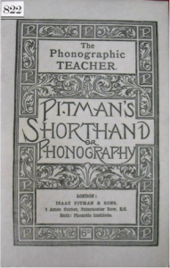 Isaac Pitman’s phonographic shorthand or ‘sound-hand’ was invented in 1837 and remains the mostly widely used system of shorthand in the world, now more commonly known as ‘Pitman Shorthand.’
 Pitman’s specific concern was to develop a system of shorthand in which audible speech – rather than just its linguistic meaning – could be perfectly reproduced from written signs. His interest in the relationship between texts and pronunciation began at a young age: coming across unknown words in Paradise Lost, he discovered that he could reconstruct their correct stress and intonation from Milton’s prosody. This interest remained with him, prompting the development and endless refinement of phonographic shorthand, and eventually leading him to establish his Phonetic Institution which was to become the headquarters of the Spelling Reform movement and the centre for its many publishing and pedagogical activities.
 hat it could be reproduced took many different forms. Alexander Melville Bell, a professor of physiological phonetics at Edinburgh, developed a system of ‘Visible Speech’ in which grammalogues depicting the shapes of sound in the human mouth were used to teach the profoundly deaf correct pronunciation. His son, Alexander Graham Bell, was such an accomplished reader of ‘Visible Speech’ that his party-trick was to use ‘Visible Speech’ transcriptions to read out loud foreign texts in languages he couldn’t speak (includng Sanskrit and Gaelic) to the satisfaction of native speakers. A. G. Bell subsequently developed the telephone (patented 1875-77). Thomas Edison invented the phonograph (the precursor to the gramophone) in 1877 which made re-playable voice-recordings by tracing a vibrating needle over wax cylinders. Turning from technological experiments to linguistic research, concerns with accurately recording the sound of speech were central to nineteenth-century investigations into philology, etymology, and regional accent. They also play out in the dialect poetry of Dorset poet William Barnes, and can, I argue, be traced in Thomas Hardy’s preoccupation with disembodied voices and forms of inscription (see ‘‘How you call to me, call to me’: Hardy’s Self-Remembering Syntax’, Victorian Poetry, Spring 2016).
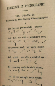 But these questions about the relation between text and voice also raise philosophical questions about the nature of human identity: the relationship between voice and presence, between being and knowing, between embodied life and the traces of human experience and knowledge we leave behind. Edison, with a mixture of pride and sadness, acknowledged the extent to which these phonographic experiments raise questions that intrude on and threaten the self-reflexive knowing that constitutes the sense of self: ‘The phonograph, in one sense, knows more than we do ourselves. For it will retain a perfect mechanical memory of many things which we may forget, even though we have said them’.
 A backwater lay-by off the M5, Junction 24, three days before Christmas. A covert exchange of an unknown document, protected only by an iPad case, occurs between man, whippet and young woman. Shady as it may seem, this is not the stuff of reconnaissance but curation. This nineteenth-century commonplace book replete with beautiful illustrations, kindly donated by John and Caroline Robinson, now lies in situ on the first floor of the English Faculty, at the heart of the inaugural exhibition of the Centre for Material Texts. The exhibition, curated by myself and my MPhil colleagues on Dr Ruth Abbott’s Writers’ Notebooks course, focuses on commonplace books and the ways in which they acted as repositories for the recording of daily life in the nineteenth century. From passages of the Bible to Byron, musings on God to sketches of the family dogs, the commonplace book offered a powerful collective storehouse for the miscellanies and medleys of material that amassed at the center of communal family life.
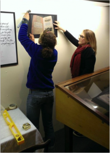 The unconventional method through which our exhibition materials were acquired proves apropos, given the unusual conditions under which the birth of our interest in commonplace books occurred. In another intrepid motorway adventure: a six hour, 250-mile minibus journey (nobly helmed by Ruth Abbott) with eight complete strangers, our group’s first weekend in Cambridge, was in fact spent in Grasmere, Cumbria working at the Wordsworth Trust. Guided by Ruth and curator Jeff Cowton we spent a full two days nestled in the archive, immersed in manuscripts and the materials which made them. It was a weekend stuffed with stuff. We created Thomas Bewick prints on a nineteenth-century printing press. We learned how to bind books on a sewing frame. Quills were carved and inks were made. Paste was pressed from pulp into paper (with the aid of a craftsman’s deckle and an improvised flattening dance on top of it). In a flurry of high spirits, fumbling with spirit-levels, our exhibition on the Wordsworth family commonplace books was installed.
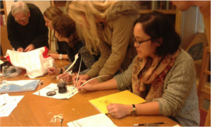 Like the chain lines and watermarks we spent the days studying in manuscripts, through curatorial collaboration we had impressed a profound mark on each other. The silence, sky and space of the Lakes and our collective academic endeavour had bound us together as tightly as the spines of the nineteenth-century treasures that lay on the archive’s shelves. What was particularly pertinent in creating this exhibition, born into being from deeply felt fellow-feeling from all parties, was that it chronicles and encourages the communal sharing of thought. The addition of our modern commonplace book to the display invites exhibition-goers to participate in shared forms of notetaking, to add their scraps and fragments of experience, their inmost thoughts, their favourite quotations and aid the creation of a beautiful, diverse collective text.
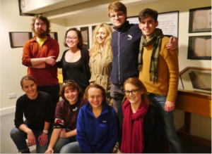 Speaking to other students who have visited Grasmere, at a recent meeting with the Wordsworth Trust at London’s Brigham Young Institute, I further realised the true powerful potential of the material. Through awe-filled eyes, each sentence suffused with a quasi-religious fervour, they recounted the moment they were allowed to see a first edition of Lyrical Ballads and handle Dorothy Wordsworth’s real notebooks. In fact, the Wordsworth Trust’s website proudly proclaims ‘Visit the Wordsworth Museum to see Dorothy’s actual notebooks’. This is something our group reflected upon as we sat around Wordsworth’s ‘actual’ fire in Dove Cottage, reading his poems, souls stirred by the transcendent beauty of breathing life back into words where they were first brought into being. In curating this exhibition, in Grasmere and in Cambridge, and through Ruth Abbott’s phenomenal notebooks course we have relearnt the overwhelming magic of the material, the ability to encounter and interact with the ‘actual’. It is in this kind of engagement with ‘actual’ manuscripts, notebooks and papers that ‘with an eye made quiet by the power/Of harmony, and the deep power of joy, / We see into the life of things’.
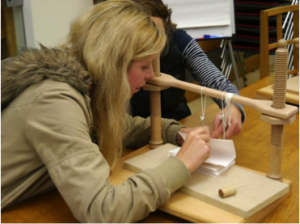 Through our immersion in the material practices from which texts develop, we learnt to cultivate a fresh appreciation for the ways in which literature is embodied and presented. The afterlives of the work we have done with these exhibitions, and the study of notebooks and manuscripts in general, like Wordsworth’s River Duddon, flow on endlessly. From future PhD projects to the reinstallation of the commonplace book exhibition in Cambridge ‘Still glides the Stream, and shall for ever glide;/The Form remains, the Function never dies’. We hope that in this latest reimagining of our display, we encourage others to see the beautiful potential in collective interaction with note-taking practices. In doing so, our work continues ‘to live, and act, and serve the future hour’.
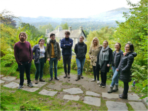 Megan Beech, MPhil Modern and Contemporary Literature
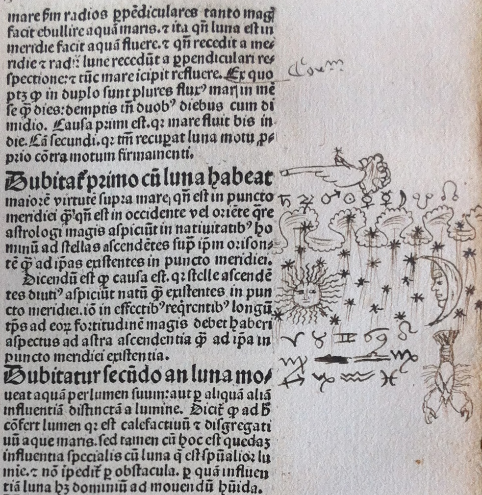
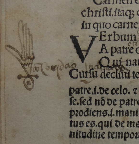
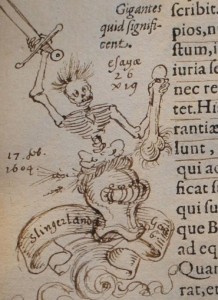 The study of visual marginalia is sometimes challenging by design, as when early modern readers created esoteric pictorial schemes that elude our best efforts to make sense of them. In their contribution to the colloquium, Alex Marr and Kate Isard (Visiting Scholar, Cambridge) discussed the copy of Vincenzo Cartari’s Imagini (1581) now in the Houghton Library at Harvard. This book has been annotated extensively in Dutch, Latin and French, and has been illustrated with a series of astrological, alchemical, mock-heraldic and downright lewd images that are at once wonderfully bizarre and exceptionally difficult to decode. The volume presents an ongoing puzzle and a provocation to further research.
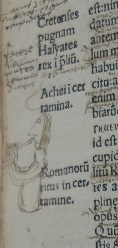
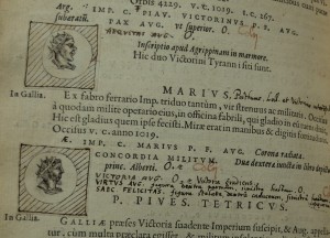 This catalogue of Roman imperial coins was compiled by the German numismatist Adolf Occo (1524-1606), and was printed in Antwerp by Christopher Plantin. It was published at the author’s expense, and perhaps to save money it had no illustrations. This copy was bought in Antwerp by James Cole in August 1588. Cole was a London silk merchant, a member of a Huguenot immigrant family and a nephew of the celebrated mapmaker Abraham Ortelius. He was a dedicated collector of rarities, including plants, fossils, coins and medals. Cole interleaved his copy of Occo’s book with numerous blank pages which he used to supplement the information provided in the printed text. He also pasted in illustrative portraits of each emperor, conspicuously improving on the original book. This sort of customization was not unusual in a period when books were sold unbound in sheets, to be put together by their purchasers. The detail and precision of Cole’s interventions reveal his intense curiosity about the classical past.