Frayed

Blog;

Lorina Bulwer 1

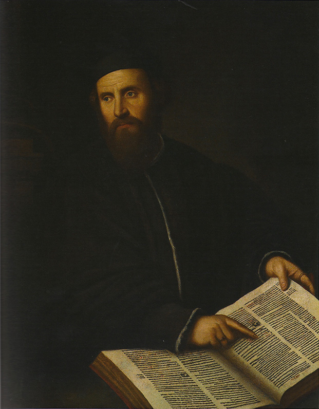
A few weeks ago I made a pilgrimage to Great Yarmouth – not, as fellow early modernists might suspect, in the footsteps of Thomas Nashe, but on the trail of a temporary exhibition at the town’s Time and Tide Museum. Frayed: Textiles on the Edge brought together a poignant collection of historic and contemporary textiles associated with personal experiences of suffering. These pieces were framed as the work of outsiders – people ‘on the edge’ in some way. But – created by individuals whose circumstances kept them in a workhouse, prison, or hospital, or who were isolated by grief or mental illness – they were also the products of the experience of confinement, of being physically or mentally locked inside.

Several of the exhibits were sorrowful works of memoriam, a reminder that in previous centuries, the death of a child was much more common, and no less painful. Anna Brereton, the maker of a patchwork counterpane and bed hangings in the eighteenth century, must have been in an almost permanent state of recent bereavement, losing four children in their infancy, and her eldest son at the age of fourteen. As some of the other pieces revealed, the reality of death was known from a young age and like adults, children also marked out their grief in stitches. There was a sampler which had been started in 1833 by a little girl called Martha Grant, and finished the following year, probably by her sister, after Martha died at the age of eleven years. Between 1823 and 1829 another young girl, Louise Buchhotz, made three small samplers, each stitched in black thread, to mark the deaths of her parents and uncle. ‘For since she’s dead, for ever gone/ O GOD my soul prepare/ To enter into heavens high gates/ In hope to meet her there’, she stitched in memory of her mother, on a tiny piece of pale linen no bigger than a page of a pocket-sized book.

In an understated way, Frayed challenged typically gendered narratives of stitching in which embroidery is thought of as a solely female occupation. I did not know that after the second world war, manufacturers of embroidery silks set up ‘Needlework for H.M. Forces’ schemes, supplying recuperating soldiers with kits to ‘help relieve the inevitable boredom of idle hours’, and give ‘the satisfaction that arises from the practice of personal skill’. Relief from boredom and satisfaction at creating something beautiful out of the horrors of the past must have in part motivated John Craske, the maker of a large woolwork tapestry depicting the evacuation of Dunkirk. Craske spent long periods recovering from physical and mental illness following military service in the first world war, but poignantly, the piece is unfinished, for he died in hospital in 1943. The contemporary tapestry cushions made by men in prison through the social enterprise Fine Cell Work demonstrated that the therapeutic value of stitching for everyone, but especially those in confined conditions, is still taken seriously today.

The therapeutic value of stitching was painfully evident in another piece, loaned for the exhibition from the V & A. Elizabeth Parker’s sampler was made around the year 1830, by a woman who worked as a nursery maid and endured cruel treatment from her employers. In letters worked in tiny red cross-stitches on linen cloth, she set down a confessional account of ‘that willful design of selfdestruction’ which tormented her. Scripture providentially helped her out of the darkness: ‘the Bible lay upon my shelf I took it down and opened it the first place that I found was the fourth chapter of S. Luke where it tells how our blessed Lord was tempted out of Satan I read it and it seemed to give me some relief for now’. Her own writing stops mid-sentence, however – ‘What will become of my soul’ – leaving nothing else but the remaining blank space of her linen page.

Lorina Bulwer 2

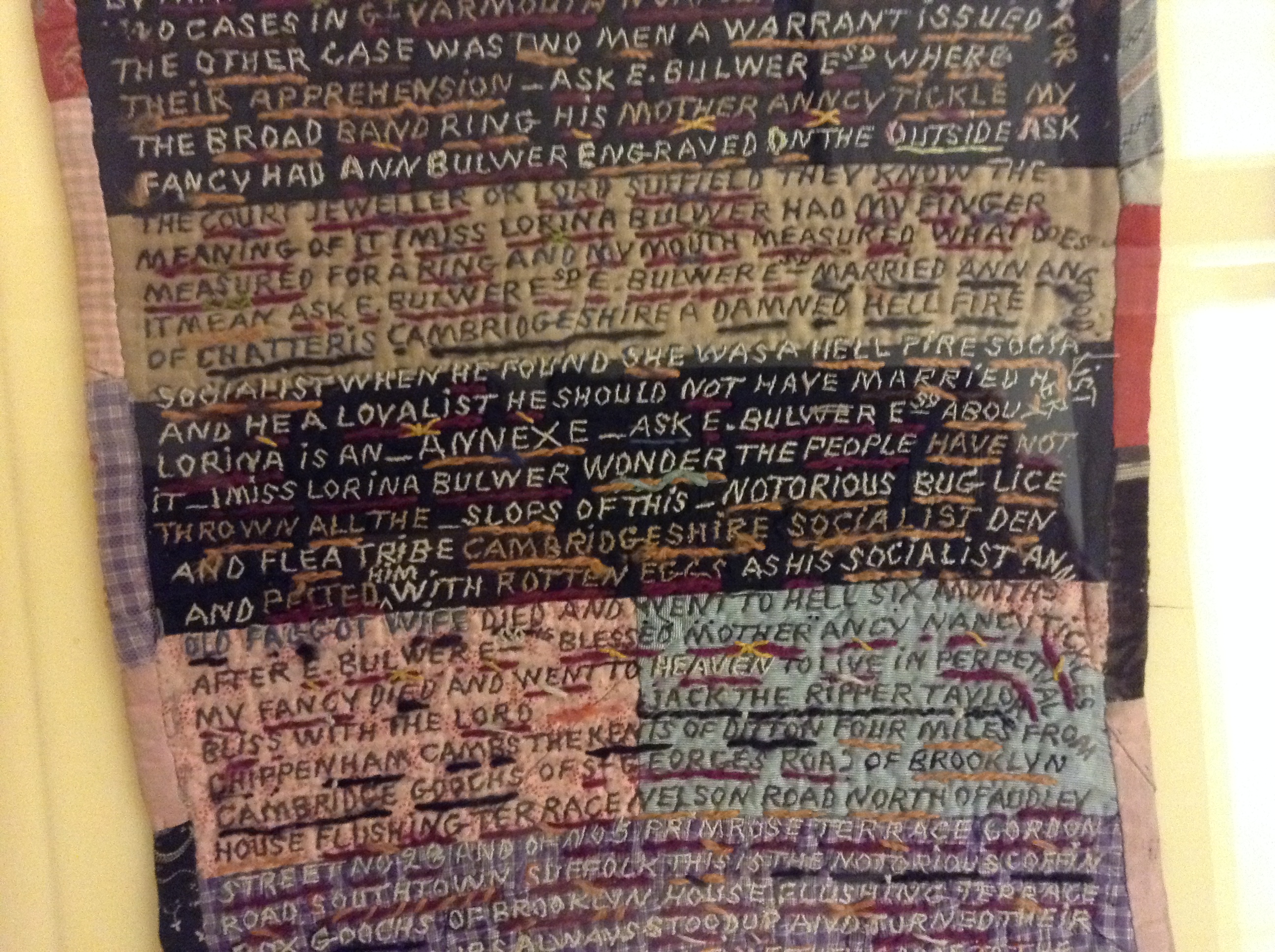
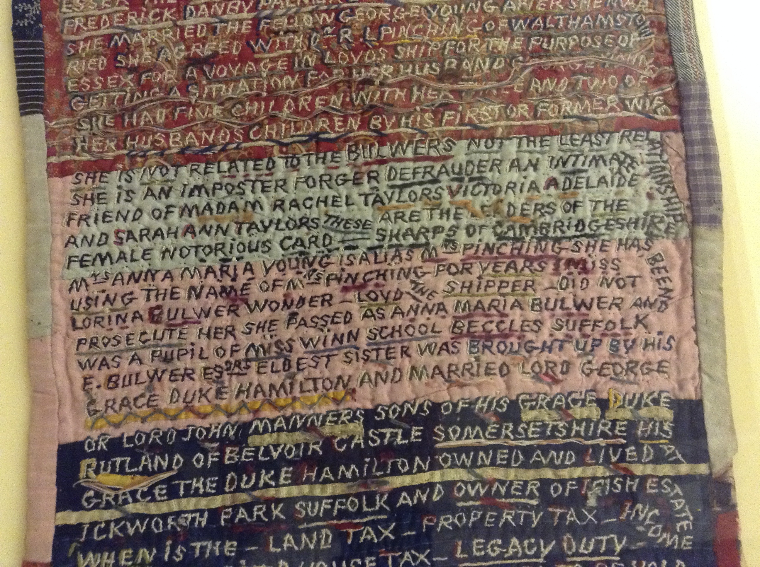
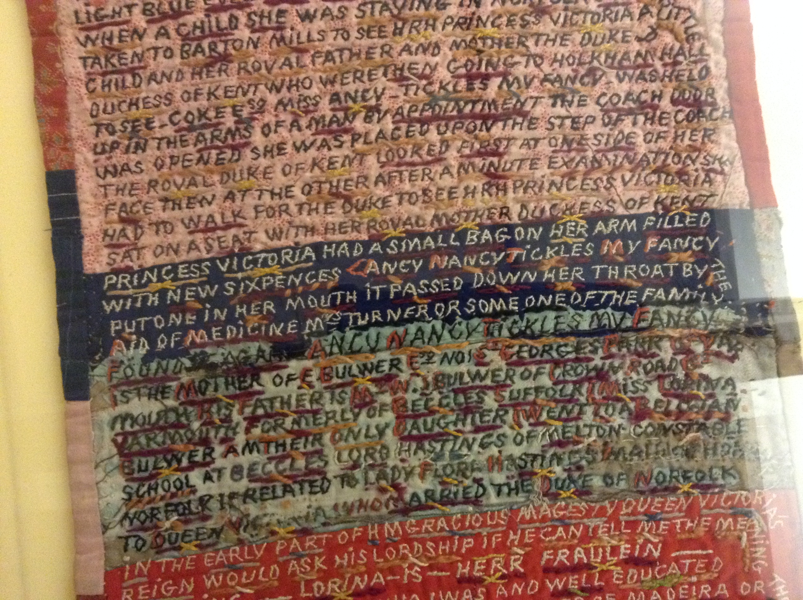
At the centre of the exhibition were two truly extraordinary stitched texts (pictured above and below) by a woman called Lorina Bulwer, who was an inmate in the ‘lunatic wing’ of the Great Yarmouth workhouse for several years at the beginning of the twentieth century. During her time there, Bulwer covered each of these three-metre lengths with densely embroidered text in which she expressed feelings of anger and frustration. Both pieces are made up of brightly coloured cotton fabrics stitched together, with a wadded lining and a backing fabric, like a quilt. Each individual letter is stitched through all of these layers. Writing in the first person, Bulwer offers a torturous working-out of her own identity. She is obsessed by names and places, frequently referring to herself by name, as well as to other people, including her own relations, members of the Royal family (she claims to be ‘Princess Victoria’s daughter’), and various towns and places in the East of England. A disturbing tangle of visceral, furious commentaries on people and situations apparently significant to her, Bulwer’s texts are impossible to summarise, but you can read transcriptions of them here.

The overall effect is one of unsettling, febrile tension between the text and its textile medium. Bulwer’s words are undoubtedly a rant, composed entirely in capital letters and without any punctuation – but their manifestation on the ‘page’ is the result of a slow process, in which each stitch has been individually formed. Writing with a needle is much slower than writing with a pen – another exhibit, Sara Impey’s machine-stitched contemporary quilt, made this point explicitly: ‘THE MOST DEMANDING ASPECT OF STITCHING IS TIME. THE STITCH DICTATES THE PACE’. Time, of course, is the one resource that imprisoned people, like Bulwer, often have most readily to hand. In her work, however, the inherently time-consuming, careful method of material composition contrasts with the angry, breathless quality of her words. It is clear that Bulwer intended her work to be read: she changes the colour of her thread according to the colour of the background so that the text is always clearly defined, and often highlights individual letters in contrasting thread where they cross over two different background colours. She underlines almost every word, and sometimes continues the text at right angles, along the borders. The cheery colours of the threads and background sit uneasily with the apparent bleakness of her experiences, and her implications of abuse. Bulwer’s desire to communicate is very evident, but this exhibition was the first time that both pieces have been displayed together (they are held in two different museum collections) – a sign, perhaps, of a general uncertainty about exactly how to read them.

 Lorina Bulwer 3

Frayed: Textiles on the Edge has now ended, but the Time and Tide Museum (shortlisted for the Council of Europe’s Museum of the Year in 2006) is definitely worth a visit.

Arts Council England grants £87,582 to create a digital archive of manuscripts

News;

Pigment & layer analysisThe illuminated manuscript collections of the Fitzwilliam Museum will be available to view in greater detail than ever before thanks to an £87,582 from Arts Council England. The Digital Layers online archive will explore stunning images of illuminated manuscripts using layer and zooming techniques inspired by internet mapping tools to show their historical, cultural and scientific secrets.

The Fitzwilliam Museum and the colleges of the University of Cambridge have one of the largest, finest and most historically important selection of illuminated manuscripts in existence. Fragile and sensitive to light, temperature and humidity, the manuscripts can only be displayed for short periods of time under special conditions to protect their delicate materials and pigments.

However, illuminated manuscripts are the most representative and best-preserved examples of medieval and Renaissance painting, doubling as portable galleries of artistic traditions through the centuries. The manuscripts collections are also one of the most popular at the Fitzwilliam, with exhibitions such as the Cambridge Illuminations in 2005 drawing record numbers of visitors.

Fitzwilliam Museum Manuscript Ms 62_f20r

The tools created for the Digital Layers project will be inspired in part by commonly used internet mapping and visualisation resources such as Google Earth and the WorldWide Telescope project (http://www.worldwidetelescope.org). They will explore the different layers of the manuscripts uploaded online, allowing the viewer to examine its creation, from original sketches hidden beneath the illuminations, to the type of pigments, inks, and paint binders used. These different layers will also reveal secrets about artists and patrons: where and when the manuscripts were made, how did highly-skilled professionals collaborate on their production, and how did owners use them over time and across countries.

All of this incredible detail and information has been made possible by two research projects being run by the Fitzwilliam; the Cambridge Illuminations and MINIARE.

Colloquium inaugurating network for the study of Caroline minuscule

News;

University of Cambridge, 23 May

Welcome: Professor Rosamond McKitterick, University of Cambridge

Confirmed speakers: David Ganz, Mary Garrison, Erik Kwakkel, Susan Rankin, Mariken Teeuwen

As publication approaches for the final volume of Bernhard Bischoff’s ‘Katalog der festländischen Handschriften des neunten Jahrhunderts’, early medieval historians and palaeographers must consider the significance of this work as well as the research that it enables on the origins, development, and varieties of Caroline minuscule. In recognition of this landmark publication and in hopes of building upon it, we are co-ordinating a project on the study of Caroline minuscule that aims to add to the great advances of the past generation of scholarship.

Our first major event is a colloquium to be held on 23 May in Cambridge. It will address the current state of research on Caroline minuscule from the late eighth to the tenth centuries and explore questions related to studying the script today, including but not limited to:

-the emergence and development of Caroline minuscule and its varieties

-peculiar features of script or style in certain manuscripts or groups of manuscripts

-comparisons between different codices, regions, scriptoria or scribes

-proposals for new palaeographical tools, methods or terminology

-the means and challenges of dating and localising manuscripts written in Caroline minuscule

-opportunities for the palaeography of Caroline minuscule in the digital age -useful but neglected aspects of Bischoff’s research

Paper proposals should be sent to Anna Dorofeeva (ad529@cam.ac.uk) or Zachary Guiliano (zmg20@cam.ac.uk) as pdfs of c. 500 words, together with a brief CV (one A4 page). The deadline is 31 March but early submission is strongly encouraged. Small bursaries may be available for travel and accommodation expenses, and responses from postgraduates and in languages other than English are especially welcome. For further information, and to join the Network, please visit carolinenetwork.weebly.com.

Galaxy’s Irresistible Reads and the future of e-books

Blog;

Galaxy – as in the chocolate bars – are currently running a promotion offering a free Kindle e-book with every bar bought. The campaign tells us some interesting things about how people are using e-books and what this means for the future. It shows that a sort of leisure reading that’s been associated with women for at least two hundred years hasn’t been changed by the coming of the Kindle and that – paradoxically – people still want physical books.galaxy-chocolate-miser-small-53433

The first thing to note is that this is a reworking of a campaign first run in 2009. That promotion involved Galaxy giving away 1 million physical books. Obviously the decision to move to e-books is a sign that marketers reckon e-books are now popular enough to count as mainstream – at least for Galaxy buyers.

What’s more significant is the fact that Galaxy are using e-books to target exactly the same set of associations that they used physical books to reach. Describing the first campaign, Galaxy’s Senior Brand Manager Sally Mellor said that ‘Women love reading, and women love chocolate.’ The campaign worked  ‘by inviting them to “melt into a good book”’. Mediacom, the agency behind the campaign, said that they were able to ‘build an association between Galaxy and this moment of female indulgence’.

Affordable indulgence is at the heart of the Galaxy brand – hence their long-running slogan ‘why  have cotton when you could have silk?’. That’s what the poster campaign for the new promotion tries to evoke. Those behind it reckon that the women who own Kindles use them in search of the same kind of convenient, cheap, but self-consciously indulgent experience they’re meant to associate with Galaxy.

So what does this tell us? The most important lesson is that, when it comes to e-books, many women see them as a way of accessing a traditional sort of reading. Galaxy’s posters don’t include pictures of Kindles but, instead, have images of physical books with a distinctly nineteenth-century appearance. People want to imagine that reading an e-book is just like reading a nice old copy they can feel in their hands. As with luxury brands, heritage is part of the package.

What’s more, props such as bookmarks appear on some posters to make it even easier to imagine the physical work of reading a paper book. There’s an interesting link here to the branded bookmarks which were made for the old campaign. The physical thing is an important part of the sense of indulgence.

This taps into readers’ aspirations. Despite the fact that the titles you can download are all contemporary novels (mostly chick-lit), the posters parody Victorian classics. One starts ‘It was the best of times, it was the best of times…’.  So whatever it is they’re actually getting, people at least want to entertain the possibility that they might read a classic on their Kindle.

These lessons fit with what we’ve already seen with successful e-book readers. In short, the more it acts like a traditional paper book, the more people like it. To these readers, the e-book is a transformative but not a revolutionary technology. What does that mean? Well, it’s transforming the ease with which books can be bought or given away, how much they cost, and where and when they can be used. But it’s not revolutionising the way readers think of books. In a broad sense, Galaxy thinks that lots of women want the same experience of indulgent me-time that a novel buyer of the 1870s – or a library subscriber of the 1790s – would understand.

What does this mean for the future? Happily for book-shops, it shows us that lots of readers don’t think e-books are an upgrade for obsolete paper books. Instead, they’re substitutes for the ‘real’ thing. Until this changes, they’ll always be a market for physical books. Of course, shops might sell less cheap paperbacks. But just as Hotel Chocolat can survive in a world where you can get a galaxy bar for 70p out of a vending machine, there’s a chance for bookshops to thrive by offering readers genuine indulgence. And those publishers who’ve started issuing deluxe editions of classics are on the right track.

Annotations in Early Printed Books

News;

A one-day workshop at the John Rylands Library

Saturday 29 March 2014, 10am–5pm

This one-day event will provide an opportunity for researchers working in this rapidly growing area of study to present current research, exchange ideas and discuss current and planned projects. Prof. Ann Blair (Harvard) will give the keynote talk on early modern note-taking. Prof. Arnoud Visser (Utrecht) will give a presentation on the ‘Annotated Books Online’ project and speak on the current state of research on annotations and marginalia. Dr Paul White (John Rylands Research Institute) will speak on the untapped potential of the Christie and Spencer collections of the John Rylands Library. The Rylands holds an abundance of early printed annotated books, many of which remain uncatalogued, and most of which have never been studied. There will also be a book handling session for delegates run by Rare Books Librarian Julianne Simpson, and a presentation from Senior Photographer James Robinson on the use of spectral imaging techniques in the study of annotations. The workshop will thus enable dialogue between academic researchers and librarians, and across the diverse disciplines and research skills that feed into the study of annotations (digital humanities, palaeography, philology). The workshop will also serve as an exploratory meeting with a view to taking forward plans for a larger international network of scholars working on annotated books. Lunch and refreshments will be provided for all in attendance.

Registration: The workshop is free to attend, but advance registration is essential. For any further enquiries and to register, please contact Dr Paul White paul.white-2@manchester.ac.uk

Venue: Christie Room/Bible Room, The John Rylands Library, 150 Deansgate, Manchester M3 3EH

dressing the book

Blog;

‘You wouldn’t want to appear at a fashionable party with a book that looked like this…’ This insight into Victorian etiquette was offered today in a talk given by Jim Secord (historian of science and a member of the CMT’s advisory committee) at the Cambridge ‘Things’ seminar. Secord’s aim was to consider the relationship between the physical presentation of books and the reading experience in the nineteenth century. Of particular interest was the development of the publisher’s cloth binding in the period, and how this related to the rise of a middle-class reading public that wanted quality and durability without the need for personalised rebinding. By thinking about the cloth of books in relation to fashionable clothing, Secord hoped to ‘get back to the reading experience and what it actually meant’ at a time when new technologies were transforming the business of making books.

larsson

Following Secord, Kristina Lundblad‘s paper began by demonstrating how much we do in fact judge a book by its cover, and how much we now rely on the fact that books are differentiated by their  covers. She displayed a striking slide showing what happens when you put the words ‘Pippi Longstocking/Astrid Lindgren’ or ‘The Gift of Death/Jacques Derrida’ on a particular illustrated front-cover, in place of the original words ‘The Girl with the Dragon Tattoo/Stieg Larsson’. Pan back in time to the early nineteenth-century and the physical forms of books were mostly very anonymous. Since their bindings were often paid for by the consumer, there was no need for them to advertise the book’s contents or to catch the eye. Only when publishers started to take over the job of binding did this situation begin to change. In England, titles appeared on covers from the 1840s; by the 1850s custom-made images might be embossed along with the author’s name and the title. By the end of the century, the covers of the book were a design space to be filled with all manner of colourful images, and each book was an individualised thing–all thanks to the marvels of mass-production.

glitter and polish

Blog;

rhymeI recently caught up with my colleague Simon Jarvis’s essay ‘Why Rhyme Pleases‘, which sets out to redeem the sound-effects of poetry from centuries of denigration. Borrowing terms from Protestant attacks on Catholic devotion, critics have long written rhyme off as a superficial jingling, a ‘trifling and artificial ornament’, a trinket or fetish. Manly, heroic poets (the archetype here being Milton, who rejected rhyme as ‘the invention of a barbarous age, to set off wretched matter and lame metre’) should have nothing to do with it. So ran the received wisdom, although most poets carried on regardless, at least until the advent of modernism.

To redeem rhyme, Jarvis turns to Alexander Pope, supposedly a poet of neoclassical order and balance, but in his view an intoxicatingly musical writer whose rich sound-world now goes largely unappreciated. A key exhibit here is The Rape of the Lock, which captures the bewitching materiality of the modern world in its bewitchments of sound:

“That Pope’s style was habitually and routinely by everyone described as ‘polished’—this itself testifies to a felt link between the intensively worked-over surface of his verse and the gleaming cabinets, tables, canes and snuff-boxes evoked in The Rape of the Lock.”

At the end of the essay, Jarvis piles up all the qualities that Pope’s contemporaries ascribed to his writing: “its sweetness, its variety, its gay finery, its embroidery, its vivacity, its colouring, its glitterings, its flourish, its debauch, its embellishment, its enflure, its tunableness, its suavity, its easiness, its spirit, its elevation, its glare, its dazzle, its fluency, its musicality, its melodiousness”. He makes a compelling case for thinking that we have lost something vital to the appreciation of poetry–a feel for its surfaces, its textures, its elusive ways of being in the world–and that without this we may be condemned to miss the point.

dream-hold, bolt-hole

Blog;

It’s World Book Day today, and for some strange reason a storage company has conducted a survey into the books in British homes. According to their findings, the average home has 138 books, and more than half of them are unread.

The implication is that we are hoarding. According to the Telegraph‘s report, ‘two thirds of those who took part said they kept books because they were emotionally attached to them, while over one in four said they hated throwing anything away’. As numerous television programmes have taught us in recent years, this kind of irrational activity needs to be stopped. Time to call in the professional declutterer, who will rid you of our inner turmoil and your surplus stuff at the same time. If you remain emotionally attached to the books, the storage firm may be able to help (first month for just £1!)

Perhaps we like the unread books, though. They are a space of possibility, a spur to dreaming. The cookery books are full of meals we might cook, one day, the travel guides of places we might stay, when we have some time and money to spare. The novels are journeys not taken, yet. Our need for the hidden realms that lie beneath the covers is beautifully captured in Angela Leighton’s poem ‘BOOK’, from her new collection ‘The Messages‘ (Shoestring Press):

BOOK

A fan of leaves, a touching brief,
a dream-hold, bolt-hole,
an answeringness like calls in sleep,

and buff or gloss, matt or shine,
accommodating hands and eyes,
you’ll touch its brainwaves shut in lines–

the moveless picture of a moving sea–
and look to hear and mean to feel
in the swim of it how to drown for real.

nota bene

Blog;

capriolo ritratto

Anyone who has spent time wandering around the churches of Venice will have imbibed the name of Cima da Conegliano (c.1459-c.1517), whose saints and madonnas pose against a background of bright cerulean skies and breathtaking landscapes, dominated by distant hill towns to which the eye wanders as if yearning to pay them a visit. This summer an exhibition in Cima’s home town will be setting the artist in the context of his place and time, and looking across the range of artistic production in sixteenth-century Conegliano and its environs. Among the pictures on display is this one by Domenico Capriolo of a studious young man with a book–the book itself beautifully rendered, a learned folio with text and commentary, decorated letters and rubrications. You can’t read the words, but you can’t help wondering what that chubby finger is pointing out.

before the autocomplete

Blog;

To live in the modern world is to be a slave to form-filling. Our births and deaths require official certification, and in the interim we receive regular reminders that we are merely a number in an endless sequence of numbers. The documents and papers that assert our identity render us anonymous, reminding us of the terms of a mass society in which we are interchangeable and insignificant.

Simon Franklin’s paper at the History of Material Texts seminar last night traced the prehistory of bureaucracy by surveying the development of printed blank forms in Russia. Printed forms have become increasingly interesting to historians of the book in recent years, largely as a way of questioning the centrality of ‘the book’ in print culture. Single-sheet blanks were produced in large numbers from the very inception of print in the West, and they played an important part in making print commercially viable–no printing house could have made a living out of the works of Aristotle.

passport

Looking at Russian forms complicates this story, however, since Russia was one of the many places where printing completely failed to enter into an alliance with market capitalism. The idea of ‘the printing press as an agent of change’ (to use Elizabeth Eisenstein’s celebrated formulation) becomes problematic in relation to a culture in which printing remained a state monopoly and where almost the only printed books were religious titles intended for use in church. Franklin’s research in Saint Petersburg has yielded a fine haul of forms of all kinds–passports, travel permits, grants of land and title–and has suggested that there was a decisive turn to print in the early eighteenth century, probably thanks to the Europeanizing project of Peter the Great. Even after this (comparatively late) move, there were frequent failures in the distribution of forms, so that people continued to produce manuscript copies with the attendant risks of forgery and malpractice. It takes a lot of effort to create a bureaucracy.

It’s easy to get absorbed in the material features of the forms themselves–the combination of printed text, decoration, handwritten names and numbers, stamps and seals… They are fascinating, I suppose, because the bureaucratic bustle, the proliferation of elements and agents, aspires to a finally unattainable ideal, a fantasy of authentication. In this sense the blank form seems to epitomise the anxieties about truth and lying that have always dogged the printed word.