Galaxy’s Irresistible Reads and the future of e-books

Blog;

Galaxy – as in the chocolate bars – are currently running a promotion offering a free Kindle e-book with every bar bought. The campaign tells us some interesting things about how people are using e-books and what this means for the future. It shows that a sort of leisure reading that’s been associated with women for at least two hundred years hasn’t been changed by the coming of the Kindle and that – paradoxically – people still want physical books.galaxy-chocolate-miser-small-53433

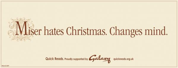
The first thing to note is that this is a reworking of a campaign first run in 2009. That promotion involved Galaxy giving away 1 million physical books. Obviously the decision to move to e-books is a sign that marketers reckon e-books are now popular enough to count as mainstream – at least for Galaxy buyers.

What’s more significant is the fact that Galaxy are using e-books to target exactly the same set of associations that they used physical books to reach. Describing the first campaign, Galaxy’s Senior Brand Manager Sally Mellor said that ‘Women love reading, and women love chocolate.’ The campaign worked  ‘by inviting them to “melt into a good book”’. Mediacom, the agency behind the campaign, said that they were able to ‘build an association between Galaxy and this moment of female indulgence’.

Affordable indulgence is at the heart of the Galaxy brand – hence their long-running slogan ‘why  have cotton when you could have silk?’. That’s what the poster campaign for the new promotion tries to evoke. Those behind it reckon that the women who own Kindles use them in search of the same kind of convenient, cheap, but self-consciously indulgent experience they’re meant to associate with Galaxy.

So what does this tell us? The most important lesson is that, when it comes to e-books, many women see them as a way of accessing a traditional sort of reading. Galaxy’s posters don’t include pictures of Kindles but, instead, have images of physical books with a distinctly nineteenth-century appearance. People want to imagine that reading an e-book is just like reading a nice old copy they can feel in their hands. As with luxury brands, heritage is part of the package.

What’s more, props such as bookmarks appear on some posters to make it even easier to imagine the physical work of reading a paper book. There’s an interesting link here to the branded bookmarks which were made for the old campaign. The physical thing is an important part of the sense of indulgence.

This taps into readers’ aspirations. Despite the fact that the titles you can download are all contemporary novels (mostly chick-lit), the posters parody Victorian classics. One starts ‘It was the best of times, it was the best of times…’.  So whatever it is they’re actually getting, people at least want to entertain the possibility that they might read a classic on their Kindle.

These lessons fit with what we’ve already seen with successful e-book readers. In short, the more it acts like a traditional paper book, the more people like it. To these readers, the e-book is a transformative but not a revolutionary technology. What does that mean? Well, it’s transforming the ease with which books can be bought or given away, how much they cost, and where and when they can be used. But it’s not revolutionising the way readers think of books. In a broad sense, Galaxy thinks that lots of women want the same experience of indulgent me-time that a novel buyer of the 1870s – or a library subscriber of the 1790s – would understand.

What does this mean for the future? Happily for book-shops, it shows us that lots of readers don’t think e-books are an upgrade for obsolete paper books. Instead, they’re substitutes for the ‘real’ thing. Until this changes, they’ll always be a market for physical books. Of course, shops might sell less cheap paperbacks. But just as Hotel Chocolat can survive in a world where you can get a galaxy bar for 70p out of a vending machine, there’s a chance for bookshops to thrive by offering readers genuine indulgence. And those publishers who’ve started issuing deluxe editions of classics are on the right track.

dressing the book

Blog;

‘You wouldn’t want to appear at a fashionable party with a book that looked like this…’ This insight into Victorian etiquette was offered today in a talk given by Jim Secord (historian of science and a member of the CMT’s advisory committee) at the Cambridge ‘Things’ seminar. Secord’s aim was to consider the relationship between the physical presentation of books and the reading experience in the nineteenth century. Of particular interest was the development of the publisher’s cloth binding in the period, and how this related to the rise of a middle-class reading public that wanted quality and durability without the need for personalised rebinding. By thinking about the cloth of books in relation to fashionable clothing, Secord hoped to ‘get back to the reading experience and what it actually meant’ at a time when new technologies were transforming the business of making books.

larsson

Following Secord, Kristina Lundblad‘s paper began by demonstrating how much we do in fact judge a book by its cover, and how much we now rely on the fact that books are differentiated by their  covers. She displayed a striking slide showing what happens when you put the words ‘Pippi Longstocking/Astrid Lindgren’ or ‘The Gift of Death/Jacques Derrida’ on a particular illustrated front-cover, in place of the original words ‘The Girl with the Dragon Tattoo/Stieg Larsson’. Pan back in time to the early nineteenth-century and the physical forms of books were mostly very anonymous. Since their bindings were often paid for by the consumer, there was no need for them to advertise the book’s contents or to catch the eye. Only when publishers started to take over the job of binding did this situation begin to change. In England, titles appeared on covers from the 1840s; by the 1850s custom-made images might be embossed along with the author’s name and the title. By the end of the century, the covers of the book were a design space to be filled with all manner of colourful images, and each book was an individualised thing–all thanks to the marvels of mass-production.

glitter and polish

Blog;

rhymeI recently caught up with my colleague Simon Jarvis’s essay ‘Why Rhyme Pleases‘, which sets out to redeem the sound-effects of poetry from centuries of denigration. Borrowing terms from Protestant attacks on Catholic devotion, critics have long written rhyme off as a superficial jingling, a ‘trifling and artificial ornament’, a trinket or fetish. Manly, heroic poets (the archetype here being Milton, who rejected rhyme as ‘the invention of a barbarous age, to set off wretched matter and lame metre’) should have nothing to do with it. So ran the received wisdom, although most poets carried on regardless, at least until the advent of modernism.

To redeem rhyme, Jarvis turns to Alexander Pope, supposedly a poet of neoclassical order and balance, but in his view an intoxicatingly musical writer whose rich sound-world now goes largely unappreciated. A key exhibit here is The Rape of the Lock, which captures the bewitching materiality of the modern world in its bewitchments of sound:

“That Pope’s style was habitually and routinely by everyone described as ‘polished’—this itself testifies to a felt link between the intensively worked-over surface of his verse and the gleaming cabinets, tables, canes and snuff-boxes evoked in The Rape of the Lock.”

At the end of the essay, Jarvis piles up all the qualities that Pope’s contemporaries ascribed to his writing: “its sweetness, its variety, its gay finery, its embroidery, its vivacity, its colouring, its glitterings, its flourish, its debauch, its embellishment, its enflure, its tunableness, its suavity, its easiness, its spirit, its elevation, its glare, its dazzle, its fluency, its musicality, its melodiousness”. He makes a compelling case for thinking that we have lost something vital to the appreciation of poetry–a feel for its surfaces, its textures, its elusive ways of being in the world–and that without this we may be condemned to miss the point.

dream-hold, bolt-hole

Blog;

It’s World Book Day today, and for some strange reason a storage company has conducted a survey into the books in British homes. According to their findings, the average home has 138 books, and more than half of them are unread.

The implication is that we are hoarding. According to the Telegraph‘s report, ‘two thirds of those who took part said they kept books because they were emotionally attached to them, while over one in four said they hated throwing anything away’. As numerous television programmes have taught us in recent years, this kind of irrational activity needs to be stopped. Time to call in the professional declutterer, who will rid you of our inner turmoil and your surplus stuff at the same time. If you remain emotionally attached to the books, the storage firm may be able to help (first month for just £1!)

Perhaps we like the unread books, though. They are a space of possibility, a spur to dreaming. The cookery books are full of meals we might cook, one day, the travel guides of places we might stay, when we have some time and money to spare. The novels are journeys not taken, yet. Our need for the hidden realms that lie beneath the covers is beautifully captured in Angela Leighton’s poem ‘BOOK’, from her new collection ‘The Messages‘ (Shoestring Press):

BOOK

A fan of leaves, a touching brief,
a dream-hold, bolt-hole,
an answeringness like calls in sleep,

and buff or gloss, matt or shine,
accommodating hands and eyes,
you’ll touch its brainwaves shut in lines–

the moveless picture of a moving sea–
and look to hear and mean to feel
in the swim of it how to drown for real.

nota bene

Blog;

capriolo ritratto

Anyone who has spent time wandering around the churches of Venice will have imbibed the name of Cima da Conegliano (c.1459-c.1517), whose saints and madonnas pose against a background of bright cerulean skies and breathtaking landscapes, dominated by distant hill towns to which the eye wanders as if yearning to pay them a visit. This summer an exhibition in Cima’s home town will be setting the artist in the context of his place and time, and looking across the range of artistic production in sixteenth-century Conegliano and its environs. Among the pictures on display is this one by Domenico Capriolo of a studious young man with a book–the book itself beautifully rendered, a learned folio with text and commentary, decorated letters and rubrications. You can’t read the words, but you can’t help wondering what that chubby finger is pointing out.

before the autocomplete

Blog;

To live in the modern world is to be a slave to form-filling. Our births and deaths require official certification, and in the interim we receive regular reminders that we are merely a number in an endless sequence of numbers. The documents and papers that assert our identity render us anonymous, reminding us of the terms of a mass society in which we are interchangeable and insignificant.

Simon Franklin’s paper at the History of Material Texts seminar last night traced the prehistory of bureaucracy by surveying the development of printed blank forms in Russia. Printed forms have become increasingly interesting to historians of the book in recent years, largely as a way of questioning the centrality of ‘the book’ in print culture. Single-sheet blanks were produced in large numbers from the very inception of print in the West, and they played an important part in making print commercially viable–no printing house could have made a living out of the works of Aristotle.

passport

Looking at Russian forms complicates this story, however, since Russia was one of the many places where printing completely failed to enter into an alliance with market capitalism. The idea of ‘the printing press as an agent of change’ (to use Elizabeth Eisenstein’s celebrated formulation) becomes problematic in relation to a culture in which printing remained a state monopoly and where almost the only printed books were religious titles intended for use in church. Franklin’s research in Saint Petersburg has yielded a fine haul of forms of all kinds–passports, travel permits, grants of land and title–and has suggested that there was a decisive turn to print in the early eighteenth century, probably thanks to the Europeanizing project of Peter the Great. Even after this (comparatively late) move, there were frequent failures in the distribution of forms, so that people continued to produce manuscript copies with the attendant risks of forgery and malpractice. It takes a lot of effort to create a bureaucracy.

It’s easy to get absorbed in the material features of the forms themselves–the combination of printed text, decoration, handwritten names and numbers, stamps and seals… They are fascinating, I suppose, because the bureaucratic bustle, the proliferation of elements and agents, aspires to a finally unattainable ideal, a fantasy of authentication. In this sense the blank form seems to epitomise the anxieties about truth and lying that have always dogged the printed word.

read my t-shirt

Blog;

Wardrobe advice from the Guardian last weekend: ‘text has never been so fashionable’.  Speculating that ‘perhaps it’s a spin off from watching subtitled Scandi dramas that these days we feel hip and culturally on-point if we’re looking at words’, the columnist finds herself no longer quite so opposed to jumpers emblazoned with a message, or, ‘a speech bubble in knitwear form’…

‘I have a repository of knowledge to maintain’

Blog;

In the most recent episode of the BBC’s Call the Midwife (a drama about a community of nursing nuns in the East End in the 1950s, based on the memoirs of Jennifer Worth), we learn that the eccentric Sister Monica Joan, now in her nineties, maintains a small personal library. The amount of time she spends tending to her ‘repository of knowledge’ (including rebinding volumes with leather and paste, and ripping the ‘heretical’ pages of the Apocrypha out of a Bible) is the cause of much frustration for the indomitable Sister Evangelina, who mutters ‘Never been a reader. Always been a doer’. Arranging her books on makeshift shelves, Sister Monica Joan complains that ‘the Dewey Decimal System is altogether too earthbound, and likely to speak loudest to pedantics’ – and instead she puts volumes by Astley Cooper and Rousseau next to each other, so that they can converse, while ‘Plato and Freud can be companions in their ignorance’. All of this playing with books is intended, as is usually the case with Sister Monica Joan’s especially eccentric moments (she is getting dementia) for bittersweet comic effect. However, contrary to Sister Evangelina’s suspicions, ‘reading’ turns out to be ‘doing’, too. In the main storyline, two young brothers are very sick, and the doctor cannot find a diagnosis for their mysterious symptoms. Noone has an answer other than the old-fashioned catch-all of ‘failure to thrive’, until Sister Monica Joan hears about it and runs through the rain in the night to give the doctor a book from ‘the reign of Queen Anne’, from her collection. I’m not sure what this book was, but it leads him to diagnose the two children with cystic fibrosis (in the 1950s, this had only recently been identified as a genetic condition). The elderly nun is vindicated, for she spoke truth in her perceived madness, and as the episode came to a close, it was pleasing to see that she was given a proper bookcase for her precious volumes.

two fingers to art

Blog;

A friend’s Facebook post:

‘Uh oh. I just tried to zoom in on a picture – in a book – using the iPad-fingers-moved-apart-manoeuvre. In my defence, the page was shiny.’

I sympathise: I’ve been looking at some illustrated books this week and reflecting on how rarely you can actually see the detail you need to see in a reproduction of a painting. In this sense, digital technology seems like a distinct advance on print. The downside is that we are going to lose any sense of scale–the relationship between the body and the artefact cannot yet be reproduced, nor does anyone seem to care much about it. But the size of a painting, or of a book for that matter, would in the past have been part of the point of it, framing your whole experience.

So I hope my 3-D printer, when it arrives, will allow me to create a LIFE-SIZE reproduction of the Mona Lisa.

pleasures of the text

Blog;

Over Christmas I read Memoirs of a Leavisite by David Ellis, Emeritus Professor of English at the University of Kent. It left me no more of a fan of the great F. R. Leavis than I was when I began, but it made me realise how much his theories of literature might still flow beneath the surface of my own reading and teaching–so I read it both with pleasure and with a kind of fascinated horror.

As befits someone brought up in Leavis’s school, Ellis confesses that he has little feel for or interest in books as material objects, though he admits one exception: the works of Roland Barthes in the Éditions du Seuil:

$(KGrHqYOKnUE1OjcYQmiBNYWd2Ef)g~~0_35

“As he became more famous he was able to publish shorter texts in this format, with bigger print, so that his book on photography (La Chambre Claire), with its wonderful expanses of white around the large lettering, became my model of what a book should look like, especially at a time when English academic publishers were cramming more and more words onto the enlarged pages, and thinner paper, of their books. With my eyesight weakening, I became a propagandist for this model until someone publishing one of my own books rather irritably told me that she was considering offering it to the public with a free white stick (an addition, I ought to have pointed out, that would not help the poorly sighted to read the print better).”

As well as saying a lot about the unending tussle between writers and publishers, and the hidden visual cues that shape our reading, this is also a good example of Ellis’s richly maudlin prose–perfect reading for a dark December day…